First a quick thank for your tremendous outpouring of support and encouraging words for my post yesterday. Yesterdays post generated the most comments I have ever gotten since I started blogging a little over a year ago…..almost 200!!!!!!! Just to be clear…this IS going to be an online shop….so everyone can come visit! I was totally overwhelmed and bowled over by your positive words and kindness!!! I wore a smile on my face the entire day! I am very excited about this project and am working hard and doing my research behind the scenes. Some orders have been placed, am working on the actual site and the wheels are very much in motion. I promise to keep you posted and hopefully sooner than later will announce the official opening of “The Enchanted Home” store. Thank you for your support. The two lucky winners of the monogrammed linens are……..
Step right up and claim your prize! Please email me with the initial you want on your towels/napkins and provide a shipping address.
On the home front…… things continue to settle down over here, its going to be a long process, one that will not be a short stint, but surely a labor of love. I have days where I have a surge of energy and feel unstoppable and days where I do absolutely nothing productive! I am however concentrating on completing a few rooms but there have been a few hiccups. Remember the beautiful rug for the family room? The one that I ordered furniture based on? Well, its too small! We tried it and the colors were magnificent but it was far too narrow. We had made some structural changes to the room which changed things a bit. Big problem. Furniture already on order. A few things we were able to stop but most of it is a done deal so we are now looking for a new family room rug, in the same colors. A challenge indeed.
I think I am going to go with the fabric for back stair hall cushion and window seat, it looks great and in the searching I have done, see nothing I like more.
Did get to the D & D building last week which was fun, I am truly like a little kid in a candy store when it comes to me and fabrics. I only had three hours but used it wisely! So….. below are some of my findings and a few (not many) new things going on over here……
The beautiful chandelier we just had installed in stair hall
It has to be raised a bit, but I love it!
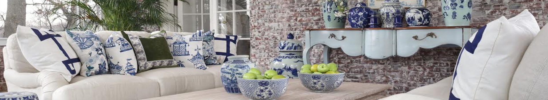
I like switching things up…..and played around with my “blue and whites” for the island…what do you think?
I know, I know…enough already! Sorry…you know I can get carried away!
We are waiting the for the shades to put on the chandelier
Pretty chair in my closet…..
Guest bathroom, now I am looking for wallpaper
Another spot for the ginger sisters
Don’t worry all the unsightly wires you see under the sofa are temporary….see I can read your mind!
Husbands bath….
Hubby’s bath lighting is done…now working on the window treatment unless visitors pulling up the house want to be greeted by my husband in the flesh:)
And I wanted to do something different for my very teeny tine computer room/small office, literally it measures 6×10 but its a small alcove off our bedroom, and enough for a good sized desk and bookcases, so…I am kind of liking this, what do you think?
The little lame “alcove/office” needs some help. As in “911”….looks like a mess with no where to go. But rest assured, I am going to make it pretty. Real pretty!
What you don’t see is it also has beautiful little butterflies in the paper, a chinoiserie style…love the colors…..
Reminder this is the palette of the bedroom
And a few close ups of the ones making it as finalists in my seletions…….
The wallpaper which I am sold on
The carpet which I love, has a trellis pattern which I adore but tone on tone..so very soft
This is a velvet stripe, thinking it would be pretty for a bench
Newly discovered, this is a beauty…maybe drapes?
Another new discovery, very soft, pretty and a little more open feeling…not sure but it is pretty
Starting to look a bit orderly in the pantry…still tons of tweaking to do though!
And last but not least two very different looks in wallpaper for the powder room off the kitchen, both work and both look actually really great. I would love your opinion on which you like!! I always love to hear……
Definitely a little more transitional than the other and than most of my house is but its a family powder room and the colors are so pretty
The soft grays and yellows are very soft and work beautifully, its a more traditional pattern….thoughts??
Wishing everyone a fabulous Saturday and rest of the weekend!
I am just so happy for you, my darling friend. The shoppe will be a HUGE success! Love love love the etched glass fixtures above your kitchen counter & the other glass accents around. So so pretty. OMG, everything you do is just perfection, but what I really love is the prettiness of your spirit. Much love, Tina-poo…
Tina- everytime I see your house it makes me feel a little faint, I kid you not. I love your updates and you are accomplishing so much. Do you ever sleep? OK what I LOVE here is the blue and whites on the island, lanterns, the paper for your office and all the selections for your master. That is going to be one amazing master suite. Your new chandelier is increidble! Love it all and am really excited about your new store so we can all have a little “enchanted home:” in our own homes! Hope you will carry those monogrammed cocktail napkins, I want to order them!
I like the wallpaper on the right for your powder room off the kitchen. Where do you suggest is the best place to look for blue and white porcelain? I love your collection.
Powder room off the kitchen…. I like the wallpaper with the yellow. And I want to see your hubby in the flesh when I drive up. Just think of the dinner conversation that we could have.
Hi, love your blog, never miss a post! Would you be so kind and tell me what that wallpaper is that you are thinking to use in your small office? Thank you so much!!! Zoe
I like the blue with yellow wallpaper. I think it brings a little sunshine into the room where the blue/gray is too plain and monotone-and in the winter we all need a little more sunshine. The blue with yellow also leaves room to mix things up more if you get tired of just one color. Good luck -oh and I am so happy your store will be online since I live so far away although I have to admit I feel bad that specialty stores are disappearing and the internet is the only place to shop- it is definitely a sign of the economy!
Can I please move into your kitchen? Seriously THE most gorgeous kitchen I have ever seen. And I love the blue and whites jars there but am torn as I also love the topiaries. You can do no wrong in my eyes, Tina!
Good morning Tina! I meant to comment yesterday but was meeting with clients and ran out of time as they were pulling up to the door. LOVE all the stuff for your future store. The bell lanterns, the sliver, the hand linens!!!! I collect monogrammed guest towels etc. I guess collect is the wrong word….I buy them like some people buy shoes. I am kicking myself now that i did not get to enter the giveaway…oh well.
I have no doubt that your on line shoppe (or brick and mortar for that matter) will be wildly successful. You have impeccable taste and the graciousness to go along with it. But the transitional one seems more peaceful, more at home in that bathroom. I would choose it. I am anxious to see what you do.
As for the wallpaper in the guest bath… I think they are both absolutely beautiful but my eye rests so much more with the “transitional one” the colors just work so well with the finishes. It seems like it was made for that room. The more traditional one is very similar to a fabric i have in my home and I love it too.
I adore the fabrics and color palette you have chosen for your bedroom. And I’ll bet when you are finished with your little computer alcove, it will feel like a jewel box! Have a great weekend.
Somehow, a sentence got moved in my comment above..sorry it is all over the place. The sentence in paragraph 2 is supposed ti be at the end of paragraph 3 sorry:)
Your house is looking stunning Tina, you’re a fabulous decorator and I love everything you are doing and are going to do! All those blue and white ginger jars are fabulous and your chandy is amazing. I also love the lamps hanging on top of your gorgeous kitchen’s island. Keep up the beautiful work, but always rest a little. FABBY
Hi Tina, Since you asked, love the grey and white wallpaper for your powder room. Hope you don’t change the French Balloon fabric on the little chair Alcove/Office room. Like your blue and whites on the kitchen island, would like to see them more bunched together. And by the way, I don’t see anything wrong with being very productive one day and taking it easy the next day. Have fun. Gina
Everything looks so stunning….what a beautiful home you have! It is so much fun to check in and see what you are up to! You are one very busy lady :o) Have a great weekend!!! ~Des
A few questions if you do not mind? Name of beautiful wallpaper for your office? Name of fabrics/paper for your master?
Comments- Love the blues and white in your kitchen, you could put rotting fruit though and it would look out of this world, its so beautiful! As far as the papers like the one on the right for your powder bath, it is more modern than the rest of your house but its very fresh and refreshing for a bathroom.
Last- your are AMAZING, your taste is amazing and I cannot wait for your store!
Since you are asking I like the gray and yellow paper for the powder room. They are both beautiful but I think its a little more interesting and more in keeping with the elegance of your home. Your bedroom and fabric/wallpaper picks are so beautiful, I cannot wait to see it finsihed. And love that paper for your little office, thats going to be such a happy space (already is pretty) Your kitchen is just so beautiful. I love it more everytime I see it. The blue and white collection looks so perfect there, though I also like the topiaires. You cannot go wrong and it is fun to swtich things up. I do it all the time. Keep all your fans posted on the store, I am ready!
I love the wallpaper that is more gray. Figured I’d choose that one since is the same colors as the one in my office. Who makes that one? May need to use it in client project. By the way, my office is small too, only 8 x 10, so you can manage with 2 feet less! It is small, but mighty and I love it! My ‘tagged’ post just went up on my blog. Thank you for the honor! xo
Each time I see pictures of your most gorgeous kitchen I think I am looking at Veranda magazine. Seriously – it is absolutely stunning. You continue to do such an incredible job with all the details in your house.
It appears everyone likes the yellow and grey, however, I personally love the other one better…its softer and something I feel moves with the rest of the house! Should you want to shake it up with some color in hand towels or accessories and then change it again in a few years or months…you can! Somewhat neutral! Love it!
I love the blue and white in your kitchen! Just looks fabulous! You have beautiful things and an eye for it all!
Love the blue and white jars on the kitchen island. I like the gray and yellow paper for the powder room. But really, you can’t go wrong with either. And I know this sounds kind of weird, but I really want to soak in your hubby’s tub!! I just love the shape of it — very elegant.
You really can’t go wrong with either wallpaper – both gorgeous, however the yellow does add warmness and feels more traditional. Your closet, bathroom area looks so pretty and I love your bedroom colors. West coast folks don’t seem to do as much wallpaper – although here in the Pacific Northwest I see more than I did when I lived down South. You’ve really opened my mind to that and I’m planning on papering the powder room off near my living room. Regarding all the blue and whites – not easy to find! I’ve purchased a few through ebay and have had difficulty getting exactly what I want. My home is a {much} scaled down version of your home – I have the marble, light and dark woods, French pieces – so I’m thrilled that you are doing the on-line shop.
I like the transitional grey and white paper the best. As an earlier commenter stated, it’s easier on the eyes. Very calming. Would you mind sharing what it is? Also, the use of the etched fixtures in your kitchen is pitch perfect. Interesting, lovely and stylish. Often those are seen in a front hall, so it’s nice to see them in another area of the home. Your posts are so eye catching. You upload so many pictures. I don’t know how you do it. What are your other hobbies? Your readers might enjoy hearing about other facets of your life too. Do you have any interest in sharing this? You are great when you stay on your topic, so maybe you want to just stay with it. You never seem to run out of things to say. I really don’t know how you do it. But if you feel like chatting about yourself and your hobbies… Would love to read about it.
I was wondering if your shop would be online. So glad it will be, and I’m sure it’ll be a huge success. For the powder room, I like the wallpaper on the left best without a doubt. I wasn’t sure at first about using it for the powder room, however. Something about the gold in the paper and the color & movement in the marble was kind of throwing me off. But, the more I looked at it I think it will be beautiful. Love how you’ve arranged your blue-and-white. I gotta see the fixtures on order for over your island. If they look any better than the lanterns there now, I don’t think I’ll be able to take it (in a good way…LOL)! Have a wonderful weekend!
I can’t speak (speechless) everything is just too beautiful for words. Both wall papers are fantastic, as is every choice you have made in your home. You can’t go wrong!
Good grief girlfriend how BIG is your house. First its drop dead gorgeous but it looks like a huge mansion. I bet I couldn’t afford your front door. (smile) Well maybe the front door. I do love your kitchen. I too have white cabinets and love them. Is that marble on the countertops? And the blue in there is so pretty.
Oh all the decisions you have to make. When we built this home I almost went crazy there were so many details and decisions. Honestly I’m glad its your job this time and not mine. Am excited about your store. How fun is that. Looking forward to hearing all about the wonderful things coming soon.
I am happy to see that things have settled enough that you can now enjoy finishing things. Everything looks beautiful, Tina. You have done a wonderful job. I just love you collection of blue and white. The pantry is over the top gorgeous, and the Chandeliers, perfection. I think I like the gray paper for the powder room. Have a nice weekend. Teresa xoxo
Tina I am not sure if you would like to share the names of the fabrics/papers you have selected for your master but I am literally in love with every one and would copy you (no worries I live in Chicago) and be done and my husband would think I am a genius! We moved to a beautiful new home, a custom house about 8 months ago and he is begging me to finish our bedroom. I am so in love with all you have selected. The papers for the bath, I like both but lean towrads the one with the yellow, more in keeping with the style of your house but the other one is fun and more casual, both lovely. And that kitchen- no words to describe how much I love it. I love my own kitchen too but honestly yours is just a dream. I hope you like cooking:-)
Oh Tina so happy your store will be online.My choice would be the traditional gray yellow for the powder room. In love with the pretty chair in your closet. Could you share the source of that please? So sorry about the family room rug snafu. Happy Saturday and have a great weekend.
Tina- I love that chandy!! It is just gorgeous and fits the spot beautifully. Your island is so great-you could put a broken glass on there and it would still be just as beautiful! I say NO CURTAINS in the hubby’s bath-give your visitors something to talk about (besides how jealous they are of your place!;>) As for the wallpaper-I really love the one on the right. I think it is subtle and more monochromatic…people will notice the tile and details rather than just focusing on the wallpaper…just my HO (Humble Opinion). Hope you have a great weekend- xo Diana
Hi Tina, I read your post so many times yesterday and never went back to leave a comment…would have loved those monogrammed cocktail napkins with a D for Diamond. I have a feeling they will make it into your “shop”…what a wonderful shop that will be. Everything you showed yesterday is something that looks like “you” and so with everyone following along this last year it will feel like we know the person behind the product. You’ve given a “real” voice to The Enchanted Home…blog or store. Your chandelier is gorgeous…it must bring a smile to your face every time you see it! Also, I adore your black island in the kitchen, beautiful detail in the corner and your blue and white collection looks very happy there! Have a wonderful weekend. xo annie
Adore the paper you have chosen for the office space. I know it will be gorgeous when you are all done with it!!! As for the powder room, I love the wallpaper with the yellows in it, but both are gorgeous. I am wondering if you could tell us what the fabric is called that is a soft blue with embroidered cream flowers in it? I adore it, and it’s just what I’ve been searching high and low for, for roman shades in my home. We just don’t have the wonderful fabric stores in Canada, that you do in the US, so I need to do much of my fabric shopping online =) I looooove seeing your updates, and the progress in your gorgeous home!
Hi Tina I have a doubt: With such a big house, why you choose a small roomfor your office? Your stair hall is STUNNING! About the wires … YEAH you could read my mind! Powder room off the kitchen… I perfer the right one. Is very delicate , at any time you can change the colour of the towels! The another one, with the passing of the times it becomes a pattern “boring to the eyes” – you know what I mean? Have a GREAT weekend and be HAPPY! Tchau, Ana Maria
HI Tina, I’m new to your blog and feel as if we shop at the same places, looking for the same color schemes! The wall paper you are considering for your “alcove area” I just put in a powder room for a client Go with it! It will look lovely with what you are already considering for your bedroom. I can see the butterflies! As for your wallpaper considerations for your family bathroom…Much harder. First off gwen Paltrow has the “transitional” Zoffany paper in her foyer of her Hampton home… Go google it. Gorgeous. While both work beautifully, I actually feel that the other choice (yellow) is a better choice for family bathroom…. A slightly less formal look (although with your finishes you are not sacrificing a polished look!)You and I share the same appreciation for “softer tones” and what we must be careful with is that we don’t overuse too much of the same. I think the yellow offers a feel that will transition nicely thru all seasons and all trends! Xo good luck! Ellen
Tina, you and I share a love of blue and white jars! They look wonderful in your kitchen. I also adore your bathroom tile. Cant wait to see what wall paper you choose. Both are beautiful, but I lean towards the one with a little yellow.
I, too, love the paper you have cchosen for your office/nook. LOVE, love, love the blue and whites on the island in the kitchen and the lanterns above…..be still my heart! I like thepaper with the yellows in it for the powder room. Can not WAIT for The Enchanted Home STORE to open!!!!!!!! It will be a HUGE success. XO, Pinky
If I have not said it before..your home is beautifull, it is exciting to see how you “move in”, thank you for sharing the journey with us. greetings from South Africa Colette
Ok… LOVE LOVE LOVE the bath tub, it is My #1 choice too I have to have it! The kitchen is stunning I love the floors, lighting, cabinetry just perfect. I think your doing a fabulous job! Your fixtures and flooring, woodwork etc. all ready are so beautiful I think the I just have one suggestion … in place of wallpaper…what about painting wide stripes alternating with matt and a shimmery paint in your powder bath, or doing a large damask shimmery stencil. Then you can age it a little if you like with a glaze. I think it is pretty to have a little different look on the walls. You can always paper later if you get board. The last time I stripped wall paper I vowed Ii would be my last..That’s just me …… I am looking forward to your on line store Tina, I know it will be awesome! P.s. The chandy in the stair well is magnificently perfect!! Have a beautiful weekend! xo, Gail casualloveselegance
Everything looks wonderful and I’m so excited about the on-line shop. I like the transitional wall-paper for the family room bathroom. Beautiful. I have a question about the lamp cords, etc. When the furniture is away from the walls and there’s carpet, where are the outlets placed so cords are unobtrusive?
Just settled in with a cup of tea to catch up with my blogging friends. SO exciting about your shop! And your home just looks prettier by the day…..I love the blue and gray damask-type wallpaper, but the touch of sunshine in the other is nice, too! Sorry, I’m not much help, there : ) Have a fabulous weekend!
Powder bath…if you are going to use the polished nickel only I would choose the blue wallpaper. If you are going to use the dark brass accessories also…I would go with the wallpaper with the golden in it.
Interestingly enough, I do like the blueish paper a lot and would probably choose it over the yellow-gold paper for any other bathroom in the house, but because it’s off the kitchen, the yellowish-gold paper tends to freshen things up and keep them light and bright, which works well with a kitchen?!?
I don’t know how you keep up with all the comments….but I’ll add to them. I fantasize about decorating/living in a house such as yours…alas, that will never be, unless I win a huge lottery! I do enjoy reading your blog and drooling on the computer screen over your pictures! I love working with patterns and colors and I love textiles. I help design/sale in a window treatment shop and I do custom framing and have a art background. I love to work with and surround myself with beautiful things. Your ginger jars look wonderful under the console and they look great on the kitchen island too! I move things around my house to create renewed interest…I guess that comes from years of managing an art gallery and working in retail where it is a necessity to keep a “fresh” look! The wallpaper selections are both beautiful and appropriate…I love both for different reasons. The blue and gray, for the geometric and symmetrical pattern that resonates in the geometric and symmetric lines of the tiles on the floor and walls. Also, the colors keep the palette in the cool tones and very monochromatic. What I love about the yellow/gold and gray floral is the juxtaposition of the more random floral pattern against the geometric and linear pattern of the tiles. The color palette is a very current combination and I love that it introduces both warm and cool tones to the space. It looks great with your cherub compote bowl your soaps are in. I suppose this would be my personal favorite as the color and pattern adds some contrast, warmth and color while also remaining somewhat subtle and calm, while keeping a slightly more traditional feel.
The yellowish wallpaper gets my vote! Love the softness of the grays and the pop of yellow color. Your new home is my get away, I relish every post that you give us. Thanks you!
Oh Tina! I missed your post yesterday because I had an early morning Dentist appointment during the time when I am typically paying my blog world visits. I am THRILLED that you will be setting up shop – and even more thrilled that it will be online so that I can visit! Wonderful news and I couldn’t be more excited for you. Pretty much everything you posted yesterday is something i would want in my home. You have such a fantastic eye. AND your house is looking gorgeous. So sorry to hear about the rug drama, but am absolutely enchanted by everything I see in your photos. Especially your blue and white friends. Swoon. I hope you have a wonderful weekend. I’m so pleased, proud and thrilled for you! XOXO
Hey Tina, looks like I have missed a lot in the few days I was gone! Congrats on the idea of the store, it will be a runaway hit for sure. I saw so things I would snatch up particularly the pillows, silver and canvas art. Oh and monogrammed linens! Your house is looking prettier than ever…is that possible? The kitchen is so faint worthy, its not even funny. Perfection in my book. Love the fabrics, and wallpapers you are considering, and lean towards the one with yellow, the other is pretty but I feel too transitional for your house, but both are really nice. Those blue and white jars on your island look really wonderful and so pretty. You must faint every time you turn a corner in that house. Looking so grand!
Hi Tina. I am so pleased to see close up pics of the pendants in the kitchen. Love love them. The inger sisters look at home under the table behind the sofa! I also liked the close up pic of your kitchen counter with the new arrangement of blue and white. Wow!! Big wow fot the chandy and the pic from the bottom of the stairs ~ just spectacular!
That new fabric that you found for the drapes in the bedroom is amazing and will be fanatstic with your other selections. I seems to be leaning to the more yellow paper for the powder room, it seems to catch the light perfectly. The office wallpaper colour is gorgeous. I like the ginger jar on your bathtub. So happy about your shop girlfriend! It’s going to be a hit. Good luck with setting it all up. Thought I had missed your house update, so happy to find this post..
House is looking beautiful – going with my first “gut” feeling on the powder room wallpaper, definitely the blue and gray transitional pattern is my fave. But love yellow too so either will look great.
*** “Oh TINA, TINA, TINA!!! What AM I going to DO with you?!?!?!” (Grins, smiles n’ chuckles!)…
*** SERIOUSLY, with all this MAGNIFICENT PERFECTION in your FAAAABULOUS new “home/manor”, the LEAST you could do is make “ONE mistake”, girlfriend (more smiles n’ grins go here!!!)… you know, one that for sure could/would make SOME of us feel a little better as WE “struggle” with OUR decisions/choices!!! (Insert ANOTHER smile there!). You ALWAYS seems to be “SPOT ON” as my British friend says!!! (Yep, you have a GREAT STYLE all your own!!!)…
In all honesty, “YA DUN GOOD, GIRFLFRIEND… REEEEEAL GOOD!!!!!!! Warmest congrats!!!
P.S. While I would have a hard time choosing one beauty over the other (re the wallpaper), I KNOW you’ve thought of the PROS n’ CONS of each. Personally and IMHO, you won’t be “goofing” when you choose and, since it’s a powder room and NOT used constantly, the main concern (that I’D have) of “getting tired of it” shouldn’t be too much of a concern here. I know this is NO “HELP”, but I KNOW you and I KNOW you’ll choose the one that “floats your boat” more than the other!!! XO, Linda ***
Everything is looking so gorgeous! Love how it’s all coming together just like clouds gently crossing the sky. Fabric selections are perfect, and love the wallpaper selections. Master bdrm fabrics soft and heavenly. I wish I could feel the fabric becasue it’s all about textures, shades, bumps and ridges. Great chair in closet/dressing room. Butler’s pantry looks great too!
Looks like your having fun now. This is part of the process that flows it’s adding the richness into the rooms and details, art, window treatments, rugs, personal items and vinettes.
It is all coming together so nicely!! Love your style and choices. I like the transitional pattern for the powder room, it is easy on the eye and the colors are very soothing. Love the blue and white additions to your vast island, I still can not get over how huge it is!! So amazing Tina!! Happy Saturday,Kathysue
So fun to see everything — I love how you take multiple photos of everything — that way we can Really see it. I especially like the fabric on the chair in your little alcove and the pale blue fabric with white embroidery that you’re considering for draperies. Thank you for sharing — we can’t get enough!
I have missed so much being MIA from the blog world here! An online shop…that sounds incredible! And the house has really come along…I can’t get over that gorgeous chandelier and magnificent entryway!
I just have to say that those beams in your kitchen: beautiful! I like the transitional wallpaper best for the powder room. And, the little alcove off your bedroom looks like a perfect spot! Your fabric choices are gorgeous! Am loving watching this progress.
Tina, You probably already posted this information, but who makes the beautiful wall paper for your master? Just gorgeous! Also who makes the lighting in your powder room and husband’s bath? I think both wallpapers are beautiful for your powder room, but I am in love with the more transitional one. Love the colors.
The soft greys and yellows for the bathroom. Both are lovely, hover in the long run I think you’ll be happier looking at that little bit of warms in the room.
I had to save some pictures, you know? I see your home and I smile.. this is such a happy home. I can fell it! I love the fabrics for your office, Tina. Can you share their names, please? I love the bench velvet one. Stunning!
About the wallpaper, I think the grey/blue goes perfectly withe elements found in the powder room, but the yellow would bring some warmth to the room. Both will look amazing. Honestly.
Lovely…all. The cozy office nook will be one of your favorite spots. Englishmen have a name for a small room filled with things you love, it is called a snuggery. Every women should have a Snuggery! Yours will certainly be filled with things you love and you never have to use the “L” word again. (as in little or lame:) as to the powder room Paper, both would be the right choice. If you are creating a flow with the whole house then the blue & grey would continue that. If you want to change it up a teeny bit then the yellow and grey would be a pleasant little hello whenever you enter. Suzi
I AM SO EXCITED FOR YOU!!!!!! That chandy above the stairs is perfect. Your bath..OMG your bath is fabulous with all the white and then the BLUE. Your kitchen island is magnificent and you have GOT to be giggling all the way!!! LOVE IT AND I HUG you with great admiration for getting through the period of having to WAIT!!!!! HAPPY SATURDAY NIGHT! Anita
I would choose the soft yellow and grey paper. It looks lovely next to the lit sconce shade- and pretty with natural sunlight too. Besides that, it looks like some exotic fruit, which makes it perfect for an off-the-kitchen powder room.
You definitely read my mind with the exposed wires – ha! Much worse than wire hangars!!
Gah, all those choices for the powder room, what a luscious palette! It may look muted, but is clearly anything but, I adore the carpet, everything! The chandelier is stunning Tina, what a perfect pick you made! The rug situation is a challenge, I have a theory this happens at least once in every endeavor of the scale you’re wrapping up: a key choice is made, furniture, etc. is purchased specifically to go with it, and kaboom…it doesn’t work because of a change along the way.
Sending you a smile for the rest of the weekend, tp
Gorgeous bathrooms,love your black and white floors,the blue and white looks beautiful on the center island! May I ask how you are going to hide the wires? I also have floating furniture and I do not want to cut a hole in my rug. It is a dilemma! I wish they had lamps that ran on some kind of a long life battery so I could do away with cords! Enjoy living in your new home!
I’m loving all of your amazing progress photos! The idea of a shop is so exciting, I’m eager to hear the process of that as well!
As for the family powder room wallpaper: I vote the yellow traditional one. This goes against my usual opinions because I generally don’t care for yellow. The design is very nice, and the alternative choice looks a little too art nouveau for my taste. Plus it’s nice to have a cheery pop of yellow every once in a while.
Tina …. all looking so beautiful and I love the blue on your kitchen bench especially with the black island bench. I missed your last post but if you start a shop it will be a huge success. I am also going to start marketing my one off antique Louis chairs recovered in very special fabrics on my blog as well. As a designer I always find that I want to use so many fabrics so this way I can and then I can sell them!!
Have a wonderful Sunday and best wishes always Frances xx
I think either wallpaper would be beautiful. Sometimes with our own home- we are so close to it, it can be hard to make decisions, but your decisions have all been great. I don’t know how you have the time to do it all!
Beautiful chandelier and beautiful pendant lamps. You are doing a lovely job on your home. If you have a chance come over and take a peek at my last post. I think you might like it.
Tina your home is coming along beautifully and I love your chandelier in your stairwell and that ceiling ornament….WOW! I don’t recall you ever showing that. I love your color palette for your bedroom the colors are soft and soothing and that wallpaper is to die for. As for your powder room while both wallpapers are gorgeous I would go with the paper that has a bit of yellow in it. The other matches to closely and will fade away and who wants that from their wallpaper? Your home is coming along beautifully so have fun playing.
Hi Tina…….I’ve just recently discovered your blog and I love your style! Thank you so much for sharing your beautiful home….it’s wonderful to see this work in progress! I love the yellow/grey wallpaper….I always suggest a powder room can be bolder and more colourful. I would even investigate more wallpapers in this vein.
I would love to know how you will hide those cords and wires….they are always such a nuisance, and I could use suggestions/ideas for my home, especially my office!
And finally….as many other people have asked, I would love to know the details for wallpaper you are thinking of for your office and also the gorgeous fabrics (especially the blue with white embroidery) for your master bedroom. Do you have a guide of some type? Would you share this information?
Thank you again for the beautiful inspiration and I’ll look forward to more ‘enchantment’ from your blog!
Tina, Your house is just perfect. I’m also a fan of the blue and white ceramics and I love the way they look in your kitchen. I also adore the tile in the bathroom and your taste is just impeccable and so inspiring! I wish you only happiness in your home…have a beautiful SUNDAY!! xo Sharon
You’re office nook is going to be soo fabulous with that wallpaper! I also love the palette for your bedroom! Never apologize for posting too much blue & white. I can’t get enough of it so I will always appreciate it. Love the updates! So much fun!
WOW! I thought I loved the ginger jars on the island until I saw them under the family room table. Eeeek…I think you need to do both – shopping!!! 🙂
I can’t get over everything. Your home is like looking at a magazine. I LOVE everything and may copy a couple of things 🙂 You won’t mind, will you? xoxo
Hello! Love your blog and wanted to put in my two cents for the powder room wallpaper. I think the one with the soft greys and yellows would be best. I think the other might blend into the marble if you used it.
Love your kitchen so much, one of the most beautiful I have ever seen! The blue and white looks beautiful and ready for spring. I am like you, like the idea of changing things up and the topiaries are beautiful too but a heavier/more wintry look.
Your whole house is just amazing. We built a few years ago, also a large custom home (but not on the same scale) and its been a great experience but even 2 years later, I am still doing and changing things constantly. Love your store idea, I think it will be a big success being able to find so many beautiful things in one spot. I can’t wait!
Tina, Love the blue and white story on your kitchen island – much better than the lemon topiaries. Start your store already I need some blue and white gingers (hope you are planning on selling these. Linda B from Jersey
Tina- I so enjoy your blog. I discovered your blog through a picture of your beautiful kitchen on Pinterest! I love the blue and white jars but have to say I also really love the topiaries. They are so pretty and I am one of the ones interested in ordering them. Your papers are also beautiful, definitely prefer the yellow/gray for your home, it is more suitable for your home. Your home is getting prettier by the day, amazing! You are my design inspiration. Thank you for that. Also would you be able to share the name of the paper for your bedroom and the one for your office, am in love with both!
I also found your blog thru Pinterest, your home is gorgeous ! Love seeing what you’ve done so far. Your design is something I would love to do but can’t, so you are a dream visually coming true.
Your blog has been so inspiring to me. Starting my own has been something I have always wanted to do and as of today… I have started my own blog as well. I visit yours several times a day and love everything you post. If you have time come over and visit…. classicallychicdesign.blogspot.com, I hope you will like what you see. It is brand new as of today so definetely a work in progress.
Looks like things are moving right along. You have chosen some beautiful wallpapers. Love your soft color pallette and the fabulous blue and white pieces. Have a great week. XO, Mona
Gorgeous photos-thanks for sharing. As to the wallpaper . . . you could almost flip a coin as either willnbe lovely. However when viewing the photo that includes both samples and includes the enitre pedestal sink, the gray transitional paper really speaks to me. While others have stated it’s too similar to your marble, I think that’s what I love. I would feel wrapped in gray lushiousness. Additionally I think the departure from traditional choices would be a fun surprise in this room. P.S. Another thought. I adore yellow and papered a bathroom with it. I have to tell you that viewing myself in this room was rough. The yellow did nothing for me. I’ve never used gray/blue in a bathroom so don’t know if thisnis a good choice for the “beauty shot” from the mirror. Good luck!
yep… moving right along, i see. getting caught up on all of your progress… everything looks beautiful! i vote for the wallpaper with shades of yellow… i feel like it adds just enough happy cheeriness. everything is stunning… as expected;)
Tina, Your taste is impeccable, and everything is so beautiful. Your blue and white makes me so happy, and the chandelier is exceptionally spectacular! Both wallpapers are lovely; I do prefer the first blue and gray “transitional.” I think the colors will be lovely with the marble. I did a similar Schumacher paper in my master bath with white marble and I now need an extra hour to get out the door in the morning – I hate to leave it! (I don’t think you’ll go wrong either way.) Barbara
Oh Tina, it’s looking so amazing. Your kitchen and that island are just spectacular. Love the dark timber and the contrast with all your beautiful blue and white. Just breathtaking. Love your giant urns. Wow. I’m envious. The wallpapers you’ve chosen are beautiful and I think the yellow one looks great. As it’s a guest too, it’s fun to be a bit brighter and do something a little different. The other is lovely too, but more subdued and I think the yellow has more impact. I get such a thrill whenever I see the bathroom tiles you have and that amazing bath in your husband’s bathroom – catches my breath every time. Just so lovely. Have you gotten lost in your new house yet?
The first drapery fabric with the cream flowers (crewel? Embroidery? ) is AMAZING! ! must do in Master! Love all the blue/white porcelain, as I have it all over my home also. LOVE the transitional grey wallpaper, better than the yellow. I think in time you would be happier with the simpler pattern and it will go with any accessories /towels you choose,since you, like myself, like to change things all the time.
Your home is stunning stunning stunning!!! I love how you show the details and your brilliant thoughts for each room! Your taste is impeccable! By the way… I have never seen marble that beautiful!
Stunning…all of it, Tina dear! For the powder room, I love the one with a bit of yellow. A little warmth can be so nice in a bathroom. You can do no wrong, your eye is impeccable! And that chandelier…have mercy!! :)) The alcove sounds like a cozy, lovely private area, and that wallpaper is stunning, fresh, and fabulous. Thank you for this glorious eye candy! Can’t wait for the shop.. xoxo, – Irina
Everything and I do mean everything is just so incredible! Love the blues and whites in the kitchen , it gives it such a fresh feeling and all the beautiful fabric and paper choices for your bedroom and office are perfect. For the powder room papers i like the yellow and gray, the other is nice but not appropriate for your house in my humble opinion.
I love both choice for the powder room. I think I would choose the yellow and grey…looks so pretty with the marble.
Your house is GORGEOUS!!! I just built my own home as well (much smaller than yours though…hahahahaha!) and find your blog such an inspiration as I decorate my home.
Could you please, please, please send me the names of the two papers for the powder room and your master??? I LOVE them and they are exactly the colors I am doing in my home. I have had such a hard time finding pretty wallpapers!
Everything is simply fabulous, as always! I’m sorry I haven’t been able to comment lately but continue to check your blog, sometimes several times a day. 🙂 Your home is just as lovely as you are and there is no doubt that your business will be a huge success. IMHO, everything you do is sheer perfection. I’m still totally obsessed with following the progress of your home and wish you all the best. BTW, I was one of I’m sure many who nominated you for best home design blog. Good luck, Tina! xoxo
Let’s see..”. Blue and white jars….check! Your husbands bath…..check. All of your fabric and wallpaper selections….double check…..boy what is not to love here!!!
Want your daily dose of Enchanted Home? Then join our email subscriber list and don't miss a single post of The Enchanted Home delivered right to your mailbox!
I was totally overwhelmed and bowled over by your positive words and kindness!!! I wore a smile on my face the entire day! I am very excited about this project and am working hard and doing my research behind the scenes. Some orders have been placed, am working on the actual site and the wheels are very much in motion. I promise to keep you posted and hopefully sooner than later will announce the official opening of “The Enchanted Home” store. Thank you for your support. The two lucky winners of the monogrammed linens are……..
Step right up and claim your prize! Please email me with the initial you want on your towels/napkins and provide a shipping address.
I am just so happy for you, my darling friend. The shoppe will be a HUGE success! Love love love the etched glass fixtures above your kitchen counter & the other glass accents around. So so pretty. OMG, everything you do is just perfection, but what I really love is the prettiness of your spirit. Much love, Tina-poo…
Tina- everytime I see your house it makes me feel a little faint, I kid you not. I love your updates and you are accomplishing so much. Do you ever sleep? OK what I LOVE here is the blue and whites on the island, lanterns, the paper for your office and all the selections for your master. That is going to be one amazing master suite. Your new chandelier is increidble! Love it all and am really excited about your new store so we can all have a little “enchanted home:” in our own homes!
Hope you will carry those monogrammed cocktail napkins, I want to order them!
can you be my decorator? Wonderful ideas and taste!
I like the wallpaper on the right for your powder room off the kitchen. Where do you suggest is the best place to look for blue and white porcelain? I love your collection.
Powder room off the kitchen…. I like the wallpaper with the yellow. And I want to see your hubby in the flesh when I drive up. Just think of the dinner conversation that we could have.
~Bliss~
Hi, love your blog, never miss a post!
Would you be so kind and tell me what that wallpaper is that you are thinking to use in your small office?
Thank you so much!!!
Zoe
love the transitional choice because it feels calmer, but either option is gorgeous.
sending you tons of energy as you prepare to open shop! how exciting!
michele
I like the wallpaper with the yellow for the powder room! And that kitchen – drool!:)
I like the blue with yellow wallpaper. I think it brings a little sunshine into the room where the blue/gray is too plain and monotone-and in the winter we all need a little more sunshine. The blue with yellow also leaves room to mix things up more if you get tired of just one color. Good luck -oh and I am so happy your store will be online since I live so far away although I have to admit I feel bad that specialty stores are disappearing and the internet is the only place to shop- it is definitely a sign of the economy!
Can I please move into your kitchen? Seriously THE most gorgeous kitchen I have ever seen. And I love the blue and whites jars there but am torn as I also love the topiaries.
You can do no wrong in my eyes, Tina!
Good morning Tina! I meant to comment yesterday but was meeting with clients and ran out of time as they were pulling up to the door. LOVE all the stuff for your future store. The bell lanterns, the sliver, the hand linens!!!! I collect monogrammed guest towels etc. I guess collect is the wrong word….I buy them like some people buy shoes. I am kicking myself now that i did not get to enter the giveaway…oh well.
I have no doubt that your on line shoppe (or brick and mortar for that matter) will be wildly successful. You have impeccable taste and the graciousness to go along with it. But the transitional one seems more peaceful, more at home in that bathroom. I would choose it. I am anxious to see what you do.
As for the wallpaper in the guest bath… I think they are both absolutely beautiful but my eye rests so much more with the “transitional one” the colors just work so well with the finishes. It seems like it was made for that room. The more traditional one is very similar to a fabric i have in my home and I love it too.
I adore the fabrics and color palette you have chosen for your bedroom. And I’ll bet when you are finished with your little computer alcove, it will feel like a jewel box! Have a great weekend.
Best,
Kim
Somehow, a sentence got moved in my comment above..sorry it is all over the place. The sentence in paragraph 2 is supposed ti be at the end of paragraph 3 sorry:)
Your house is looking stunning Tina, you’re a fabulous decorator and I love everything you are doing and are going to do! All those blue and white ginger jars are fabulous and your chandy is amazing. I also love the lamps hanging on top of your gorgeous kitchen’s island. Keep up the beautiful work, but always rest a little.
FABBY
Ernie meenie miney mo on the wallpaper they are both perfect in your powder bath. I just love all of your blue pottery
Hi Tina, Since you asked, love the grey and white wallpaper for your powder room. Hope you don’t change the French Balloon fabric on the little chair Alcove/Office room. Like your blue and whites on the kitchen island, would like to see them more bunched together.
And by the way, I don’t see anything wrong with being very productive one day and taking it easy the next day. Have fun. Gina
Everything looks so stunning….what a beautiful home you have! It is so much fun to check in and see what you are up to! You are one very busy lady :o)
Have a great weekend!!!
~Des
A few questions if you do not mind?
Name of beautiful wallpaper for your office?
Name of fabrics/paper for your master?
Comments-
Love the blues and white in your kitchen, you could put rotting fruit though and it would look out of this world, its so beautiful!
As far as the papers like the one on the right for your powder bath, it is more modern than the rest of your house but its very fresh and refreshing for a bathroom.
Last- your are AMAZING, your taste is amazing and I cannot wait for your store!
I vote for the wallpaper on the left, with a touch of yellow for a nice contrast to all the grey tones. Just beautiful!
I like the wallpaper with the yellow. It injects a little life and warmth, like a dab of sunlight.
Since you are asking I like the gray and yellow paper for the powder room. They are both beautiful but I think its a little more interesting and more in keeping with the elegance of your home. Your bedroom and fabric/wallpaper picks are so beautiful, I cannot wait to see it finsihed.
And love that paper for your little office, thats going to be such a happy space (already is pretty) Your kitchen is just so beautiful. I love it more everytime I see it. The blue and white collection looks so perfect there, though I also like the topiaires. You cannot go wrong and it is fun to swtich things up. I do it all the time.
Keep all your fans posted on the store, I am ready!
I love the wallpaper that is more gray. Figured I’d choose that one since is the same colors as the one in my office. Who makes that one? May need to use it in client project. By the way, my office is small too, only 8 x 10, so you can manage with 2 feet less! It is small, but mighty and I love it! My ‘tagged’ post just went up on my blog. Thank you for the honor! xo
Each time I see pictures of your most gorgeous kitchen I think I am looking at Veranda magazine. Seriously – it is absolutely stunning. You continue to do such an incredible job with all the details in your house.
It appears everyone likes the yellow and grey, however, I personally love the other one better…its softer and something I feel moves with the rest of the house! Should you want to shake it up with some color in hand towels or accessories and then change it again in a few years or months…you can! Somewhat neutral! Love it!
I love the blue and white in your kitchen! Just looks fabulous! You have beautiful things and an eye for it all!
Love your blog and love all you share!
Love the blue and white jars on the kitchen island. I like the gray and yellow paper for the powder room. But really, you can’t go wrong with either. And I know this sounds kind of weird, but I really want to soak in your hubby’s tub!! I just love the shape of it — very elegant.
You really can’t go wrong with either wallpaper – both gorgeous, however the yellow does add warmness and feels more traditional. Your closet, bathroom area looks so pretty and I love your bedroom colors. West coast folks don’t seem to do as much wallpaper – although here in the Pacific Northwest I see more than I did when I lived down South. You’ve really opened my mind to that and I’m planning on papering the powder room off near my living room. Regarding all the blue and whites – not easy to find! I’ve purchased a few through ebay and have had difficulty getting exactly what I want. My home is a {much} scaled down version of your home – I have the marble, light and dark woods, French pieces – so I’m thrilled that you are doing the on-line shop.
Have a wonderful weekend Tina.
leslie
I like the transitional grey and white paper the best. As an earlier commenter stated, it’s easier on the eyes. Very calming. Would you mind sharing what it is? Also, the use of the etched fixtures in your kitchen is pitch perfect. Interesting, lovely and stylish. Often those are seen in a front hall, so it’s nice to see them in another area of the home. Your posts are so eye catching. You upload so many pictures. I don’t know how you do it. What are your other hobbies? Your readers might enjoy hearing about other facets of your life too. Do you have any interest in sharing this? You are great when you stay on your topic, so maybe you want to just stay with it. You never seem to run out of things to say. I really don’t know how you do it. But if you feel like chatting about yourself and your hobbies… Would love to read about it.
I was wondering if your shop would be online. So glad it will be, and I’m sure it’ll be a huge success. For the powder room, I like the wallpaper on the left best without a doubt. I wasn’t sure at first about using it for the powder room, however. Something about the gold in the paper and the color & movement in the marble was kind of throwing me off. But, the more I looked at it I think it will be beautiful. Love how you’ve arranged your blue-and-white. I gotta see the fixtures on order for over your island. If they look any better than the lanterns there now, I don’t think I’ll be able to take it (in a good way…LOL)! Have a wonderful weekend!
I can’t speak (speechless) everything is just too beautiful for words. Both wall papers are fantastic, as is every choice you have made in your home. You can’t go wrong!
Good grief girlfriend how BIG is your house. First its drop dead gorgeous but it looks like a huge mansion. I bet I couldn’t afford your front door. (smile) Well maybe the front door. I do love your kitchen. I too have white cabinets and love them. Is that marble on the countertops? And the blue in there is so pretty.
Oh all the decisions you have to make. When we built this home I almost went crazy there were so many details and decisions. Honestly I’m glad its your job this time and not mine. Am excited about your store. How fun is that. Looking forward to hearing all about the wonderful things coming soon.
Nann
Stunning, love the shots with the sunlight filtering in…
I am happy to see that things have settled enough that you can now enjoy finishing things. Everything looks beautiful, Tina. You have done a wonderful job. I just love you collection of blue and white. The pantry is over the top gorgeous, and the Chandeliers, perfection. I think I like the gray paper for the powder room.
Have a nice weekend.
Teresa
xoxo
Tina I am not sure if you would like to share the names of the fabrics/papers you have selected for your master but I am literally in love with every one and would copy you (no worries I live in Chicago) and be done and my husband would think I am a genius!
We moved to a beautiful new home, a custom house about 8 months ago and he is begging me to finish our bedroom. I am so in love with all you have selected.
The papers for the bath, I like both but lean towrads the one with the yellow, more in keeping with the style of your house but the other one is fun and more casual, both lovely.
And that kitchen- no words to describe how much I love it. I love my own kitchen too but honestly yours is just a dream. I hope you like cooking:-)
Your husband’s bathroom is awesome. Is he so happy he married you?
Oh Tina so happy your store will be online.My choice would be the traditional gray yellow for the powder room. In love with the pretty chair in your closet. Could you share the source of that please? So sorry about the family room rug snafu. Happy Saturday and have a great weekend.
Tina- I love that chandy!! It is just gorgeous and fits the spot beautifully. Your island is so great-you could put a broken glass on there and it would still be just as beautiful! I say NO CURTAINS in the hubby’s bath-give your visitors something to talk about (besides how jealous they are of your place!;>) As for the wallpaper-I really love the one on the right. I think it is subtle and more monochromatic…people will notice the tile and details rather than just focusing on the wallpaper…just my HO (Humble Opinion). Hope you have a great weekend- xo Diana
Hi Tina,
I read your post so many times yesterday and never went back to leave a comment…would have loved those monogrammed cocktail napkins with a D for Diamond. I have a feeling they will make it into your “shop”…what a wonderful shop that will be. Everything you showed yesterday is something that looks like “you” and so with everyone following along this last year it will feel like we know the person behind the product. You’ve given a “real” voice to The Enchanted Home…blog or store. Your chandelier is gorgeous…it must bring a smile to your face every time you see it! Also, I adore your black island in the kitchen, beautiful detail in the corner and your blue and white collection looks very happy there! Have a wonderful weekend.
xo
annie
Adore the paper you have chosen for the office space. I know it will be gorgeous when you are all done with it!!! As for the powder room, I love the wallpaper with the yellows in it, but both are gorgeous. I am wondering if you could tell us what the fabric is called that is a soft blue with embroidered cream flowers in it? I adore it, and it’s just what I’ve been searching high and low for, for roman shades in my home. We just don’t have the wonderful fabric stores in Canada, that you do in the US, so I need to do much of my fabric shopping online =) I looooove seeing your updates, and the progress in your gorgeous home!
Hi Tina
I have a doubt: With such a big house, why you choose a small roomfor your office?
Your stair hall is STUNNING!
About the wires … YEAH you could read my mind!
Powder room off the kitchen… I perfer the right one. Is very delicate , at any time you can change the colour of the towels!
The another one, with the passing of the times it becomes a pattern “boring to the eyes” – you know what I mean?
Have a GREAT weekend and be HAPPY!
Tchau, Ana Maria
HI Tina,
I’m new to your blog and feel as if we shop at the same places, looking for the same color schemes! The wall paper you are considering for your “alcove area” I just put in a powder room for a client Go with it! It will look lovely with what you are already considering for your bedroom. I can see the butterflies!
As for your wallpaper considerations for your family bathroom…Much harder. First off gwen Paltrow has the “transitional” Zoffany paper in her foyer of her Hampton home… Go google it. Gorgeous. While both work beautifully, I actually feel that the other choice (yellow) is a better choice for family bathroom…. A slightly less formal look (although with your finishes you are not sacrificing a polished look!)You and I share the same appreciation for “softer tones” and what we must be careful with is that we don’t overuse too much of the same. I think the yellow offers a feel that will transition nicely thru all seasons and all trends!
Xo good luck! Ellen
Tina, you and I share a love of blue and white jars! They look wonderful in your kitchen. I also adore your bathroom tile. Cant wait to see what wall paper you choose. Both are beautiful, but I lean towards the one with a little yellow.
I, too, love the paper you have cchosen for your office/nook. LOVE, love, love the blue and whites on the island in the kitchen and the lanterns above…..be still my heart! I like thepaper with the yellows in it for the powder room. Can not WAIT for The Enchanted Home STORE to open!!!!!!!! It will be a HUGE success. XO, Pinky
If I have not said it before..your home is beautifull, it is exciting to see how you “move in”, thank you for sharing the journey with us.
greetings from South Africa
Colette
Ok… LOVE LOVE LOVE the bath tub, it is My #1 choice too I have to have it! The kitchen is stunning I love the floors, lighting, cabinetry just perfect. I think your doing a fabulous job! Your fixtures and flooring, woodwork etc. all ready are so beautiful I think the I just have one suggestion … in place of wallpaper…what about painting wide stripes alternating with matt and a shimmery paint in your powder bath, or doing a large damask shimmery stencil. Then you can age it a little if you like with a glaze. I think it is pretty to have a little different look on the walls. You can always paper later if you get board.
The last time I stripped wall paper I vowed Ii would be my last..That’s just me ……
I am looking forward to your on line store Tina, I know it will be awesome!
P.s. The chandy in the stair well is magnificently perfect!!
Have a beautiful weekend!
xo,
Gail
casualloveselegance
Everything looks wonderful and I’m so excited about the on-line shop. I like the transitional wall-paper for the family room bathroom. Beautiful. I have a question about the lamp cords, etc. When the furniture is away from the walls and there’s carpet, where are the outlets placed so cords are unobtrusive?
In the floor?
Just settled in with a cup
of tea to catch up with my
blogging friends. SO exciting
about your shop! And your
home just looks prettier by
the day…..I love the blue and
gray damask-type wallpaper,
but the touch of sunshine in
the other is nice, too! Sorry,
I’m not much help, there : )
Have a fabulous weekend!
xx Suzanne
Powder bath…if you are going to use the polished nickel only I would choose the blue wallpaper. If you are going to use the dark brass accessories also…I would go with the wallpaper with the golden in it.
Lovely, lovely!!
Janis Covington Stufflebeam
Can’t wait to see your shop open!
Everything is looking lovely at home, that chandelier is stunning. And the staircase! Swoon!
I definitely love the grey and yellow paper, it’s stunning! That touch of golden yellow adds so much more visual interest. No contest for me.
Have a great week-end, Tina!
Interestingly enough, I do like the blueish paper a lot and would probably choose it over the yellow-gold paper for any other bathroom in the house, but because it’s off the kitchen, the yellowish-gold paper tends to freshen things up and keep them light and bright, which works well with a kitchen?!?
I don’t know how you keep up with all the comments….but I’ll add to them.
I fantasize about decorating/living in a house such as yours…alas, that will never be, unless I win a huge lottery! I do enjoy reading your blog and drooling on the computer screen over your pictures!
I love working with patterns and colors and I love textiles. I help design/sale in a window treatment shop and I do custom framing and have a art background. I love to work with and surround myself with beautiful things.
Your ginger jars look wonderful under the console and they look great on the kitchen island too! I move things around my house to create renewed interest…I guess that comes from years of managing an art gallery and working in retail where it is a necessity to keep a “fresh” look!
The wallpaper selections are both beautiful and appropriate…I love both for different reasons. The blue and gray, for the geometric and symmetrical pattern that resonates in the geometric and symmetric lines of the tiles on the floor and walls. Also, the colors keep the palette in the cool tones and very monochromatic.
What I love about the yellow/gold and gray floral is the juxtaposition of the more random floral pattern against the geometric and linear pattern of the tiles. The color palette is a very current combination and I love that it introduces both warm and cool tones to the space. It looks great with your cherub compote bowl your soaps are in. I suppose this would be my personal favorite as the color and pattern adds some contrast, warmth and color while also remaining somewhat subtle and calm, while keeping a slightly more traditional feel.
The yellowish wallpaper gets my vote! Love the softness of the grays and the pop of yellow color. Your new home is my get away, I relish every post that you give us.
Thanks you!
Tina,
I love the paper with the yellow in it. The yellow picks up your polished nickel faucet and adds interest.
Kathy in Wisconsin
Everytime I see your home I love it more andd more. The wall paper is very pretty. I love the chandelier.
I love the pantry very pretty.
Oh Tina! I missed your post yesterday because I had an early morning Dentist appointment during the time when I am typically paying my blog world visits. I am THRILLED that you will be setting up shop – and even more thrilled that it will be online so that I can visit! Wonderful news and I couldn’t be more excited for you. Pretty much everything you posted yesterday is something i would want in my home. You have such a fantastic eye. AND your house is looking gorgeous. So sorry to hear about the rug drama, but am absolutely enchanted by everything I see in your photos. Especially your blue and white friends. Swoon. I hope you have a wonderful weekend. I’m so pleased, proud and thrilled for you! XOXO
Hey Tina, looks like I have missed a lot in the few days I was gone! Congrats on the idea of the store, it will be a runaway hit for sure. I saw so things I would snatch up particularly the pillows, silver and canvas art. Oh and monogrammed linens!
Your house is looking prettier than ever…is that possible? The kitchen is so faint worthy, its not even funny. Perfection in my book.
Love the fabrics, and wallpapers you are considering, and lean towards the one with yellow, the other is pretty but I feel too transitional for your house, but both are really nice.
Those blue and white jars on your island look really wonderful and so pretty. You must faint every time you turn a corner in that house. Looking so grand!
Hi Tina. I am so pleased to see close up pics of the pendants in the kitchen. Love love them. The inger sisters look at home under the table behind the sofa! I also liked the close up pic of your kitchen counter with the new arrangement of blue and white. Wow!! Big wow fot the chandy and the pic from the bottom of the stairs ~ just spectacular!
That new fabric that you found for the drapes in the bedroom is amazing and will be fanatstic with your other selections. I seems to be leaning to the more yellow paper for the powder room, it seems to catch the light perfectly. The office wallpaper colour is gorgeous. I like the ginger jar on your bathtub. So happy about your shop girlfriend! It’s going to be a hit. Good luck with setting it all up. Thought I had missed your house update, so happy to find this post..
Have a great weekend and thank for the eyecandy
xx
Veronica
Love following your updates and design choices! For what its worth…I like the wall paper with the grey and gold/brown tones.
Pat in Saratoga, Ca.
House is looking beautiful – going with my first “gut” feeling on the powder room wallpaper, definitely the blue and gray transitional pattern is my fave. But love yellow too so either will look great.
*** “Oh TINA, TINA, TINA!!! What AM I going to DO with you?!?!?!” (Grins, smiles n’ chuckles!)…
*** SERIOUSLY, with all this MAGNIFICENT PERFECTION in your FAAAABULOUS new “home/manor”, the LEAST you could do is make “ONE mistake”, girlfriend (more smiles n’ grins go here!!!)… you know, one that for sure could/would make SOME of us feel a little better as WE “struggle” with OUR decisions/choices!!! (Insert ANOTHER smile there!). You ALWAYS seems to be “SPOT ON” as my British friend says!!! (Yep, you have a GREAT STYLE all your own!!!)…
In all honesty, “YA DUN GOOD, GIRFLFRIEND… REEEEEAL GOOD!!!!!!! Warmest congrats!!!
Warmest wishes n’ blessings,
Linda (in AZ *)
[email protected]
P.S. While I would have a hard time choosing one beauty over the other (re the wallpaper), I KNOW you’ve thought of the PROS n’ CONS of each. Personally and IMHO, you won’t be “goofing” when you choose and, since it’s a powder room and NOT used constantly, the main concern (that I’D have) of “getting tired of it” shouldn’t be too much of a concern here. I know this is NO “HELP”, but I KNOW you and I KNOW you’ll choose the one that “floats your boat” more than the other!!! XO, Linda ***
Tina,
Congrats to the winners!
Everything is looking so gorgeous! Love how it’s all coming together just like clouds gently crossing the sky. Fabric selections are perfect, and love the wallpaper selections. Master bdrm fabrics soft and heavenly. I wish I could feel the fabric becasue it’s all about textures, shades, bumps and ridges. Great chair in closet/dressing room. Butler’s pantry looks great too!
Looks like your having fun now. This is part of the process that flows it’s adding the richness into the rooms and details, art, window treatments, rugs, personal items and vinettes.
Happy weekend!
Bette
It is all coming together so nicely!! Love your style and choices. I like the transitional pattern for the powder room, it is easy on the eye and the colors are very soothing. Love the blue and white additions to your vast island, I still can not get over how huge it is!! So amazing Tina!! Happy Saturday,Kathysue
So fun to see everything — I love how you take multiple photos of everything — that way we can Really see it. I especially like the fabric on the chair in your little alcove and the pale blue fabric with white embroidery that you’re considering for draperies. Thank you for sharing — we can’t get enough!
I have missed so much being MIA from the blog world here! An online shop…that sounds incredible! And the house has really come along…I can’t get over that gorgeous chandelier and magnificent entryway!
I just have to say that those beams in your kitchen: beautiful! I like the transitional wallpaper best for the powder room. And, the little alcove off your bedroom looks like a perfect spot! Your fabric choices are gorgeous! Am loving watching this progress.
Tina,
You probably already posted this information, but who makes the beautiful wall paper for your master? Just gorgeous! Also who makes the lighting in your powder room and husband’s bath? I think both wallpapers are beautiful for your powder room, but I am in love with the more transitional one. Love the colors.
The soft greys and yellows for the bathroom. Both are lovely, hover in the long run I think you’ll be happier looking at that little bit of warms in the room.
For the bathroom wallpaper I love the one on the right! Beautiful! Your kitchen keeps looking better and better!
Hi sweetie!
I had to save some pictures, you know? I see your home and I smile.. this is such a happy home. I can fell it! I love the fabrics for your office, Tina. Can you share their names, please? I love the bench velvet one. Stunning!
About the wallpaper, I think the grey/blue goes perfectly withe elements found in the powder room, but the yellow would bring some warmth to the room. Both will look amazing. Honestly.
I hoe you have a great weekend, my friend.
Big hugs,
Luciane at HomeBunch.com
Lovely…all. The cozy office nook will be one of your favorite spots. Englishmen have a name for a small room filled with things you love, it is called a snuggery. Every women should have a Snuggery! Yours will certainly be filled with things you love and you never have to use the “L” word again. (as in little or lame:) as to the powder room Paper, both would be the right choice. If you are creating a flow with the whole house then the blue & grey would continue that. If you want to change it up a teeny bit then the yellow and grey would be a pleasant little hello whenever you enter. Suzi
Can’t wait for the Enchanted Home Store to open! I am ready to order!
Love the yellow and gray wall paper,perfect!
Darling Tina,
I AM SO EXCITED FOR YOU!!!!!! That chandy above the stairs is perfect. Your bath..OMG your bath is fabulous with all the white and then the BLUE. Your kitchen island is magnificent and you have GOT to be giggling all the way!!! LOVE IT AND I HUG you with great admiration for getting through the period of having to WAIT!!!!! HAPPY SATURDAY NIGHT! Anita
Your kitchen is especially gorgeous – the marble you chose is stunning!
The entire house is a work of art and feast for the eyes. Thank you for sharing it!
I would choose the soft yellow and grey paper. It looks lovely next to the lit sconce shade- and pretty with natural sunlight too. Besides that, it looks like some exotic fruit, which makes it perfect for an off-the-kitchen powder room.
You definitely read my mind with the exposed wires – ha! Much worse than wire hangars!!
Gah, all those choices for the powder room, what a luscious palette! It may look muted, but is clearly anything but, I adore the carpet, everything! The chandelier is stunning Tina, what a perfect pick you made! The rug situation is a challenge, I have a theory this happens at least once in every endeavor of the scale you’re wrapping up: a key choice is made, furniture, etc. is purchased specifically to go with it, and kaboom…it doesn’t work because of a change along the way.
Sending you a smile for the rest of the weekend,
tp
Gorgeous bathrooms,love your black and white floors,the blue and white looks beautiful on the center island! May I ask how you are going to hide the wires? I also have floating furniture and I do not want to cut a hole in my rug. It is a dilemma!
I wish they had lamps that ran on some kind of a long life battery so I could do away with cords!
Enjoy living in your new home!
Dori
You home is coming together nicely. All of the pictures are beautiful..but the one of the stairwell is breath taking!!!
I am sure your shop will do well. You have allowed fellow bloggers into your dream house and shared your style in the process. Much success!!
I’m loving all of your amazing progress photos! The idea of a shop is so exciting, I’m eager to hear the process of that as well!
As for the family powder room wallpaper: I vote the yellow traditional one. This goes against my usual opinions because I generally don’t care for yellow. The design is very nice, and the alternative choice looks a little too art nouveau for my taste. Plus it’s nice to have a cheery pop of yellow every once in a while.
Tina …. all looking so beautiful and I love the blue on your kitchen bench especially with the black island bench. I missed your last post but if you start a shop it will be a huge success. I am also going to start marketing my one off antique Louis chairs recovered in very special fabrics on my blog as well. As a designer I always find that I want to use so many fabrics so this way I can and then I can sell them!!
Have a wonderful Sunday and best wishes always
Frances xx
ps I love the grey and yellow for the wallpaper for the powder room …. stunning and with that twist of yellow if is perfect! xx Frances
I think either wallpaper would be beautiful. Sometimes with our own home- we are so close to it, it can be hard to make decisions, but your decisions have all been great. I don’t know how you have the time to do it all!
Beautiful chandelier and beautiful pendant lamps. You are doing a lovely job on your home.
If you have a chance come over and take a peek at my last post. I think you might like it.
Tina your home is coming along beautifully and I love your chandelier in your stairwell and that ceiling ornament….WOW! I don’t recall you ever showing that. I love your color palette for your bedroom the colors are soft and soothing and that wallpaper is to die for. As for your powder room while both wallpapers are gorgeous I would go with the paper that has a bit of yellow in it. The other matches to closely and will fade away and who wants that from their wallpaper? Your home is coming along beautifully so have fun playing.
Enjoy your Sunday!
XX
Debra~
Hi Tina…….I’ve just recently discovered your blog and I love your style! Thank you so much for sharing your beautiful home….it’s wonderful to see this work in progress! I love the yellow/grey wallpaper….I always suggest a powder room can be bolder and more colourful. I would even investigate more wallpapers in this vein.
I would love to know how you will hide those cords and wires….they are always such a nuisance, and I could use suggestions/ideas for my home, especially my office!
And finally….as many other people have asked, I would love to know the details for wallpaper you are thinking of for your office and also the gorgeous fabrics (especially the blue with white embroidery) for your master bedroom. Do you have a guide of some type? Would you share this information?
Thank you again for the beautiful inspiration and I’ll look forward to more ‘enchantment’ from your blog!
Cori
Tina,
Your house is just perfect. I’m also a fan of the blue and white ceramics and I love the way they look in your kitchen. I also adore the tile in the bathroom and your taste is just impeccable and so inspiring! I wish you only happiness in your home…have a beautiful SUNDAY!!
xo
Sharon
You’re office nook is going to be soo fabulous with that wallpaper! I also love the palette for your bedroom! Never apologize for posting too much blue & white. I can’t get enough of it so I will always appreciate it. Love the updates! So much fun!
WOW! I thought I loved the ginger jars on the island until I saw them under the family room table. Eeeek…I think you need to do both – shopping!!! 🙂
I can’t get over everything. Your home is like looking at a magazine. I LOVE everything and may copy a couple of things 🙂 You won’t mind, will you? xoxo
I love the blue and white on your island in the kitchen. Off to copy you right now!
Hello! Love your blog and wanted to put in my two cents for the powder room wallpaper. I think the one with the soft greys and yellows would be best. I think the other might blend into the marble if you used it.
Love your kitchen so much, one of the most beautiful I have ever seen!
The blue and white looks beautiful and ready for spring. I am like you, like the idea of changing things up and the topiaries are beautiful too but a heavier/more wintry look.
Your whole house is just amazing. We built a few years ago, also a large custom home (but not on the same scale) and its been a great experience but even 2 years later, I am still doing and changing things constantly. Love your store idea, I think it will be a big success being able to find so many beautiful things in one spot. I can’t wait!
Tina,
Love the blue and white story on your kitchen island – much better than the lemon topiaries. Start your store already I need some blue and white gingers (hope you are planning on selling these. Linda B from Jersey
Tina- I so enjoy your blog. I discovered your blog through a picture of your beautiful kitchen on Pinterest! I love the blue and white jars but have to say I also really love the topiaries. They are so pretty and I am one of the ones interested in ordering them.
Your papers are also beautiful, definitely prefer the yellow/gray for your home, it is more suitable for your home.
Your home is getting prettier by the day, amazing! You are my design inspiration. Thank you for that.
Also would you be able to share the name of the paper for your bedroom and the one for your office, am in love with both!
I also found your blog thru Pinterest, your home is gorgeous ! Love seeing what you’ve done so far. Your design is something I would love to do but can’t, so you are a dream visually coming true.
So many beautiful details! So exciting to see everything evolve.
Best wishes,
Bubble & Squeak
Tina,
Your blog has been so inspiring to me. Starting my own has been something I have always wanted to do and as of today… I have started my own blog as well. I visit yours several times a day and love everything you post. If you have time come over and visit…. classicallychicdesign.blogspot.com, I hope you will like what you see. It is brand new as of today so definetely a work in progress.
Looks like things are moving right along. You have chosen some beautiful wallpapers. Love your soft color pallette and the fabulous blue and white pieces. Have a great week. XO, Mona
Gorgeous photos-thanks for sharing. As to the wallpaper . . . you could almost flip a coin as either willnbe lovely. However when viewing the photo that includes both samples and includes the enitre pedestal sink, the gray transitional paper really speaks to me. While others have stated it’s too similar to your marble, I think that’s what I love. I would feel wrapped in gray lushiousness. Additionally I think the departure from traditional choices would be a fun surprise in this room. P.S. Another thought. I adore yellow and papered a bathroom with it. I have to tell you that viewing myself in this room was rough. The yellow did nothing for me. I’ve never used gray/blue in a bathroom so don’t know if thisnis a good choice for the “beauty shot” from the mirror. Good luck!
P.P.S. Writing from my iPad is tough. Sorry for the typos!!
yep… moving right along, i see. getting caught up on all of your progress… everything looks beautiful! i vote for the wallpaper with shades of yellow… i feel like it adds just enough happy cheeriness. everything is stunning… as expected;)
Tina,
Your taste is impeccable, and everything is so beautiful. Your blue and white makes me so happy, and the chandelier is exceptionally spectacular! Both wallpapers are lovely; I do prefer the first blue and gray “transitional.” I think the colors will be lovely with the marble. I did a similar Schumacher paper in my master bath with white marble and I now need an extra hour to get out the door in the morning – I hate to leave it!
(I don’t think you’ll go wrong either way.)
Barbara
I love the gray modern wall covering for the bathroom!!!
Happy weekend!
http://www.donnaviningblog.com
Oh Tina, it’s looking so amazing. Your kitchen and that island are just spectacular. Love the dark timber and the contrast with all your beautiful blue and white. Just breathtaking. Love your giant urns. Wow. I’m envious. The wallpapers you’ve chosen are beautiful and I think the yellow one looks great. As it’s a guest too, it’s fun to be a bit brighter and do something a little different. The other is lovely too, but more subdued and I think the yellow has more impact. I get such a thrill whenever I see the bathroom tiles you have and that amazing bath in your husband’s bathroom – catches my breath every time. Just so lovely. Have you gotten lost in your new house yet?
The first drapery fabric with the cream flowers (crewel? Embroidery? ) is AMAZING! ! must do in Master! Love all the blue/white porcelain, as I have it all over my home also. LOVE the transitional grey wallpaper, better than the yellow. I think in time you would be happier with the simpler pattern and it will go with any accessories /towels you choose,since you, like myself, like to change things all the time.
Your home is stunning stunning stunning!!! I love how you show the details and your brilliant thoughts for each room! Your taste is impeccable! By the way… I have never seen marble that beautiful!
much love,
Des
The one on the right!
I love the blue and white ginger jars, they are just gorgeous and so timeless! Your home looks amazing, you have the most exquisite taste in decor.
Stunning…all of it, Tina dear!
For the powder room, I love the one with a bit of yellow. A little warmth can be so nice in a bathroom.
You can do no wrong, your eye is impeccable!
And that chandelier…have mercy!! :))
The alcove sounds like a cozy, lovely private area, and that wallpaper is stunning, fresh, and fabulous. Thank you for this glorious eye candy!
Can’t wait for the shop..
xoxo,
– Irina
My gosh … the chandelier is stunning. I love all the blue and white china in the kitchen as well – it adds a touch of freshness!
x
Melissah
Everything and I do mean everything is just so incredible! Love the blues and whites in the kitchen , it gives it such a fresh feeling and all the beautiful fabric and paper choices for your bedroom and office are perfect.
For the powder room papers i like the yellow and gray, the other is nice but not appropriate for your house in my humble opinion.
I love both choice for the powder room. I think I would choose the yellow and grey…looks so pretty with the marble.
Your house is GORGEOUS!!! I just built my own home as well (much smaller than yours though…hahahahaha!) and find your blog such an inspiration as I decorate my home.
Could you please, please, please send me the names of the two papers for the powder room and your master??? I LOVE them and they are exactly the colors I am doing in my home. I have had such a hard time finding pretty wallpapers!
Thank you!
Melanie
http://www.onelittlebirdblog.blogspot.com
Everything is simply fabulous, as always! I’m sorry I haven’t been able to comment lately but continue to check your blog, sometimes several times a day. 🙂 Your home is just as lovely as you are and there is no doubt that your business will be a huge success. IMHO, everything you do is sheer perfection. I’m still totally obsessed with following the progress of your home and wish you all the best. BTW, I was one of I’m sure many who nominated you for best home design blog. Good luck, Tina! xoxo
Let’s see..”. Blue and white jars….check! Your husbands bath…..check. All of your fabric and wallpaper selections….double check…..boy what is not to love here!!!
Blue white jars, bathrooms and chandeliers! Solid post!