Be sure to check out all of my new arrivals, so many exciting new things!! Click here to see….
Good afternoon! Hope you had a great weekend, I am finally on the mend and today was a serious “catch up” day. Thankfully I had started this post a week or so ago and just put the finishing touches on.
So here I am with chapter 4 of the Bluff Diaries…things are moving along I am happy to say. We have pretty much signed off on the interiors and I am loving the flow, it’s going to be a great space with a lot of open living. I am thrilled with how it’s all coming together and now we are tweaking the outside elevations.
The first round of permits has been submitted so fingers are crossed that we could start building maybe late June/early July! As we inch closer, I am starting to think about the house in a more realistic sense, how we will use it and live there day to day (when we are there).
One room that I think we will use a lot is a study/small-ish family room right off the kitchen with access to the long back porch and a view of the lake. I can imagine that I will look to retreat there early in the morning with a cup of coffee and late in the afternoon with a glass of wine or cocktail:)
I have this persistent vision for some reason of doing lacquered built ins. If I get really daring, I would do them in a pale blue/gray but the safe/left side of my brain says do a pale wheat/taupe color. Truthfully either color could be spectacular.
I see a beautiful worn soft colored rug (think Oushak) a comfy but good looking couch, a few really cozy club chairs, maybe a small desk. I see built ins with plenty of bookshelves and no over head lighting, just a few perfectly placed lamps for soft lighting.
So as I daydream about a lacquered room that is what’s on my mind this go around and this is one room I feel like I know exactly what I want to do and chances are this will not change. I did some “investigative research” (makes it sound official) and spent a lot of time to find the images that best convey the look I am after. So here are some pictures to drive home my point……
This picture best illustrates the look I am after, love the color, the tones and the overall feeling…..from John B. Murray
And yet this below is my argument (and a mighty good one) for the pale blue, love the feeling here and the colors! I happened to see this house 2 years ago on a house tour and this room stayed with me ever since! SB Long,
And look at the before and after picture that I found in my “investigative research”…amazing!
So seeing them both….which would you choose?
Here is another variation of the blue, though what I would use would have a bit more gray but this is the idea- I would also would consider doing the back pantry area in this color if I don’t do the study in blue
Plan on having ample bookcases like above
This is a color I have used, Stony Ground by Farrow and Ball, and this would be the colorway if I go the taupe route
And if go the pale blue/gray route, Borrowed Light also a Farrow and Ball color would be a great way to go
Love the idea of wallpapering the back of the bookshelves
This is a great picture to show the palette and overall feeling I am going for, Phoebe Howard
These both show a pale blue/gray finish which is awfully pretty!
This is a different colorway (but so beautiful) however I do love the way the sofa is nestled into the bookcases, a clever use of space, Phoebe Howard
Both of these pictures above and below beautifully exemplify the overall feeling/tones I see for this space, soft and soothing
Now a look at some of the actual elements that would go in this room….
This rug would be beautifully in this room I am dreaming up:)
Coffee tables by Hickory Chair
Sherill sofa
Lee sofa
Love both of these lamps and the more transitional feeling of them, Chrsitsopher Spitzmeiler
This fabric (Fabricut) is not necessarily my top pick in design, but it has all the colors to a tee that I am looking for, so keeping it on the backburner, because you never know, I could see it as a simple pleated Roman shade or soft drapes finished with a tonal wide tape like this one below from Samuel and Sons-
Both of these pillows would fit right in with what I see in the room…..
OK now you want to see how tall this looks on a mood board? I am really loving it…..
I must say I really love the way this is headed, its nice to feel so certain about at least one of the rooms! Whereas the others I am in a few directions, this one I really think I could do right away if I had to, I feel that certain.
Do you have a preference of the pale taupe vs. the pale blue/gray/green painted cabinetry? Would love your take so vote if you are so inclined, I always value what all of you have to say.
If you want to see other installments of the Bluff Diaries, go to the top right corner where it says “search” and type in Bluff Diaries, it will take you to all the other “chapters”. Next time around I hope to share the interior layout with you. Thank you for stopping in. Until next time…..
Tina,
The pale blue/grey is a perfect backdrop for the look you are going for. The beige has already become a bit staid and lacks the definition and even the warmth of the space. If you are anywhere near the water the blue:grey is a perfect “landscape ” color!
All the best,
Maggie
Wow, what a HARD choice! I LOVE them both. I think I like the blue/gray best because it’s not something you have currently in your home–I don’t think? You can’t go wrong with either choice. They’re both lovely. Can’t wait to see the finished product!
Hi Tina,
I love your idea. I don’t know your site location but will say of all my vacation time spent in that area, the blue/gray would be my preference. There is something about the color that feels like an extension of the sky and water in that region, or maybe because it’s such a cool color that it offers a reprieve from the heat. Either way, I would vote a million times yes, to the blue/grey color!
I just came back from my 2nd visit to Palmetto Bluffs. My mind is spinning on how to retire there from the Los Angeles area. While there, I pictured the interior of the amazing home in the movie Something’s Gotta Give. Very sophisticated but beach casual. Sisal rugs, stripes, linen, wicker… What ever you choose, just picture your boys plopping down with their friends after coming in from the water sports or other many activities to do there. You already have a stunning, proper home in the north. Thanks for doing The Bluff Diaries! I look forward to seeing each new edition!
I also usually lead to the more neutral colors for cabinetry. This time I am absolutely positive your pale grey/blue is the perfect choice. No doubt. Leave the neutrals in NY and enjoy a lovely different in PB.
I love all of your elements here a lot!!! Except I wonder if a bit more casual lamps might enhance your sophisticated casual look. Whatever you choose, it will be spectacular!
I have always loved the way taupe pops blue and white accents. Since I am assuming you would use lots of your blue and white pieces I would choose the taupe. I find it more restful in a neutral color pallet.
The taupe is my choice, so rich in its subtlety. I may be wrong on this next point, but is the blue just a bit more predictable for that area??? I confess to having the blue/taupe/apple green in my Dallas house and felt compelled to change it up at CT Beach house to whites and creams to avoid a predictable beach you look. I expect either choice will turn out beautifully.
I love the blue gray due to location. We have a home at the coast and the blues just feel so right there. But I would not put wallpaper in bookcase. Too trendy but love it or grass lots on the walls…congratulations! Love your new project!
Love the blue/gray-ish idea for the built-ins. It is calm and peaceful looking and you won’t see it repeated in a lot of other houses! I have those colors in my family room and I love it. I did liven up the space with a cheetah print ottoman. Would love to know the name of the floral fabric on the pillow. Thanks!!?
I am a lover of blue even more than you????:)…..but have to say I love the Borrowed light color. The rooms by Phoebe Howard are so serene and peaceful as is the first picture you featured with these color tones. Then the rug you are considering and just a touch of other soft blue Ina throw or pillow. Just me.
I voted for the blue-gray, since it would be different for you, but the taupe would let you switch out accent colors whenever you wanted a change. Whichever you decide,I hope you do the bookcases surrounding the sofa. It’s a look I’ve always wanted myself and would love to see how it turns out!
Very pretty choices, love how the design isn’t the predictable “beach theme” too many use here on the east coast. But then again, Southern style tends to be more refined. Before son started rowing in high school, we would head down to Hilton Head every year. Love the lifestyle. When the day comes that we buy/reno/build in that part of the country, will absolutely knock off Barclay Butera’s California beach house that I believe was once owned by Betty Davis. Jewel box of a place with sisal/sea grass rugs, navy/blues/white and touches of red accents, along with your favorite blue & white Chinese export pottery.
Agree w/ Michelle: would love linen upholstery everywhere but with teenage boys and two big dogs, hello Sunbrella!
BTW: didn’t the ‘Something’s Gotta Give’ d?cor come straight out of Restoration Hardware?
I am sure whatever you choose it will be beautiful. If I had to choose I would pick the blue gray . Living in the south the heat and humidity can become so overwhelming sometimes that the blue gray would be a nice change.
Both choices are beautiful. But I do love the blue gray. It is lovely to look at the pictures, and mull it all over. Thankyou for sharing such inspirational ideas.
Blue gray all the way! It’s a coastal community so don’t shy away from that vibe. Taupe is neutral but you have plenty of that in your gorgeous castle.
I’m an interior designer and I am pulled toward the first picture with wheat/cream colors. It’s fresh and crisp. The blue looks
tired to me. The Fabricut fabric would be great for pillows with the wheat/cream room. Love the tan and cream check accents also.
What fun watching the plans for Palmetto Bluff unfold!! I am a sucker for blue so I would vote blue. Your inspiration photos are all gorgeous! Enjoy your week, Tina! xoxo
Both color choices are beautiful. I would, however, consider the light in the room you’re going to use it in.. One may look better than the other depending on the exposure.
This is unusual for me, but I prefer the beige. It has an open, airier feel to it that is very welcoming. Your pillows and other accessories, especially the pillows with blue/gray in the pattern, would be stunning with that background.
The beige/wheat rooms are so lovely, that would be my choice. They seem so comfortable and inviting. The blue seems more formal and not the right vibe for this house.
It’s going to be amazing! Just love the colors and I don’t think there is anything quite as much fun as decorating a beach house…adore your picks! Happy start to your week and glad you’re feeling better!!
i’m gaga over your color scheme and plan. loving the lacquer. i like the taupe but can’t imagine you could go wrong with the blue. so happy you are feeling better and are energized to make these decisions for the bluffs house! peace.
Stunning options. I don’t see how you could go wrong!
I am surprising myself, but the taupe/greige lacquer would be so rich, so luxe-it would be a statement. From your detailed and highly anticipated design reports over the years, and I write this sincerely, I feel strongly the color choices you choose go so deep, textural and multi-dimensional that a photo likely does not always convey the overall depth of a room done in monochromatic, tonal hues. I imagine it is a delight of the senses with fabrics, rich paints, layered lighting, furniture details and art that leads to the atmosphere far beyond hue.
The 1-2 punch could be followed up with something more daring than you might try in your northern home: artwork, lighting fixtures, and much more.
Choose in peace: it will be a most special place for you and your loved ones.
First time responder, long time reader.
I’d like to add and commend your reader base. Such classy and supportive comments on your home building reports. Thanks for including us on the adventures.
I am an interior designer and used Borrowed Light for a client’s great room. Fabulous! So fabulous that I have having a difficult time getting that client to use any other color in her home. In the past, she only had white, white, white on their walls.
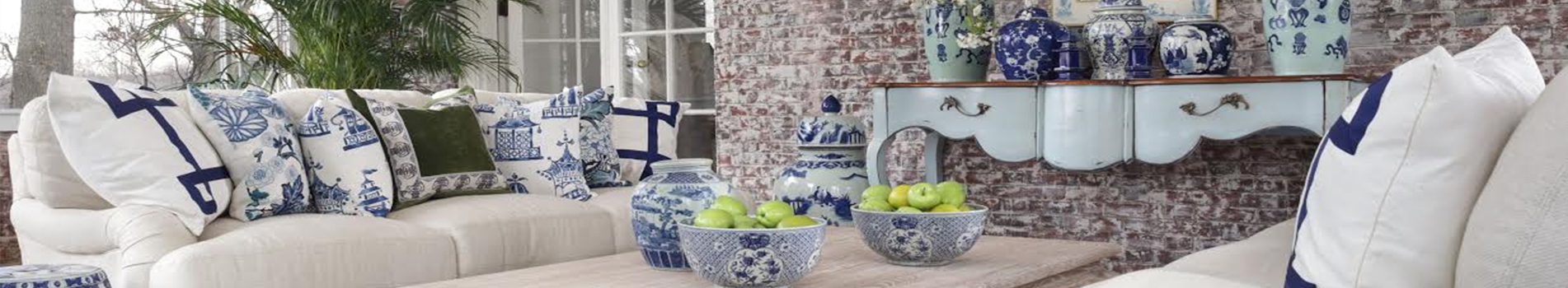
Also, I purchased 2 of your Chinese porcelain pots for my daughter to use as major focal points in her casual living area. They’re perfect and she can pop plants in and out with little effort and have something stunning. Thank you!
Want your daily dose of Enchanted Home? Then join our email subscriber list and don't miss a single post of The Enchanted Home delivered right to your mailbox!
Be sure to check out all of my new arrivals, so many exciting new things!! Click here to see….
Good afternoon! Hope you had a great weekend, I am finally on the mend and today was a serious “catch up” day. Thankfully I had started this post a week or so ago and just put the finishing touches on.
So here I am with chapter 4 of the Bluff Diaries…things are moving along I am happy to say. We have pretty much signed off on the interiors and I am loving the flow, it’s going to be a great space with a lot of open living. I am thrilled with how it’s all coming together and now we are tweaking the outside elevations.
The first round of permits has been submitted so fingers are crossed that we could start building maybe late June/early July! As we inch closer, I am starting to think about the house in a more realistic sense, how we will use it and live there day to day (when we are there).
One room that I think we will use a lot is a study/small-ish family room right off the kitchen with access to the long back porch and a view of the lake. I can imagine that I will look to retreat there early in the morning with a cup of coffee and late in the afternoon with a glass of wine or cocktail:)
I have this persistent vision for some reason of doing lacquered built ins. If I get really daring, I would do them in a pale blue/gray but the safe/left side of my brain says do a pale wheat/taupe color. Truthfully either color could be spectacular.
I see a beautiful worn soft colored rug (think Oushak) a comfy but good looking couch, a few really cozy club chairs, maybe a small desk. I see built ins with plenty of bookshelves and no over head lighting, just a few perfectly placed lamps for soft lighting.
So as I daydream about a lacquered room that is what’s on my mind this go around and this is one room I feel like I know exactly what I want to do and chances are this will not change. I did some “investigative research” (makes it sound official) and spent a lot of time to find the images that best convey the look I am after. So here are some pictures to drive home my point……
This picture best illustrates the look I am after, love the color, the tones and the overall feeling…..from John B. Murray
And yet this below is my argument (and a mighty good one) for the pale blue, love the feeling here and the colors! I happened to see this house 2 years ago on a house tour and this room stayed with me ever since! SB Long,
And look at the before and after picture that I found in my “investigative research”…amazing!
So seeing them both….which would you choose?
Here is another variation of the blue, though what I would use would have a bit more gray but this is the idea- I would also would consider doing the back pantry area in this color if I don’t do the study in blue
Plan on having ample bookcases like above
This is a color I have used, Stony Ground by Farrow and Ball, and this would be the colorway if I go the taupe route
And if go the pale blue/gray route, Borrowed Light also a Farrow and Ball color would be a great way to go
Love the idea of wallpapering the back of the bookshelves
This is a great picture to show the palette and overall feeling I am going for, Phoebe Howard
These both show a pale blue/gray finish which is awfully pretty!
This is a different colorway (but so beautiful) however I do love the way the sofa is nestled into the bookcases, a clever use of space, Phoebe Howard
Both of these pictures above and below beautifully exemplify the overall feeling/tones I see for this space, soft and soothing
Now a look at some of the actual elements that would go in this room….
This rug would be beautifully in this room I am dreaming up:)
Coffee tables by Hickory Chair
Sherill sofa
Lee sofa
Love both of these lamps and the more transitional feeling of them, Chrsitsopher Spitzmeiler
This fabric (Fabricut) is not necessarily my top pick in design, but it has all the colors to a tee that I am looking for, so keeping it on the backburner, because you never know, I could see it as a simple pleated Roman shade or soft drapes finished with a tonal wide tape like this one below from Samuel and Sons-
Both of these pillows would fit right in with what I see in the room…..
OK now you want to see how tall this looks on a mood board? I am really loving it…..
I must say I really love the way this is headed, its nice to feel so certain about at least one of the rooms! Whereas the others I am in a few directions, this one I really think I could do right away if I had to, I feel that certain.
Do you have a preference of the pale taupe vs. the pale blue/gray/green painted cabinetry? Would love your take so vote if you are so inclined, I always value what all of you have to say.
If you want to see other installments of the Bluff Diaries, go to the top right corner where it says “search” and type in Bluff Diaries, it will take you to all the other “chapters”. Next time around I hope to share the interior layout with you. Thank you for stopping in. Until next time…..
PS If you missed my Seven on Sunday, click here
PPS Until tomorrow, ALL silver and chinoiserie tole is 20%! Click here to visit shop
Tina,
The pale blue/grey is a perfect backdrop for the look you are going for. The beige has already become a bit staid and lacks the definition and even the warmth of the space. If you are anywhere near the water the blue:grey is a perfect “landscape ” color!
All the best,
Maggie
Wow, what a HARD choice! I LOVE them both. I think I like the blue/gray best because it’s not something you have currently in your home–I don’t think? You can’t go wrong with either choice. They’re both lovely. Can’t wait to see the finished product!
Hi Tina,
I love your idea. I don’t know your site location but will say of all my vacation time spent in that area, the blue/gray would be my preference. There is something about the color that feels like an extension of the sky and water in that region, or maybe because it’s such a cool color that it offers a reprieve from the heat. Either way, I would vote a million times yes, to the blue/grey color!
I just came back from my 2nd visit to Palmetto Bluffs. My mind is spinning on how to retire there from the Los Angeles area. While there, I pictured the interior of the amazing home in the movie Something’s Gotta Give. Very sophisticated but beach casual. Sisal rugs, stripes, linen, wicker… What ever you choose, just picture your boys plopping down with their friends after coming in from the water sports or other many activities to do there. You already have a stunning, proper home in the north. Thanks for doing The Bluff Diaries! I look forward to seeing each new edition!
I also usually lead to the more neutral colors for cabinetry. This time I am absolutely positive your pale grey/blue is the perfect choice. No doubt. Leave the neutrals in NY and enjoy a lovely different in PB.
I love all of your elements here a lot!!! Except I wonder if a bit more casual lamps might enhance your sophisticated casual look. Whatever you choose, it will be spectacular!
So happy to hear your plans are moving along and you are loving the direction it’s taking. Very exciting! Can’t wait for the next update.
I have always loved the way taupe pops blue and white accents. Since I am assuming you would use lots of your blue and white pieces I would choose the taupe. I find it more restful in a neutral color pallet.
The taupe is my choice, so rich in its subtlety. I may be wrong on this next point, but is the blue just a bit more predictable for that area??? I confess to having the blue/taupe/apple green in my Dallas house and felt compelled to change it up at CT Beach house to whites and creams to avoid a predictable beach you look. I expect either choice will turn out beautifully.
I love the blue gray due to location. We have a home at the coast and the blues just feel so right there. But I would not put wallpaper in bookcase. Too trendy but love it or grass lots on the walls…congratulations! Love your new project!
You always wanted the blue gray. Go for it !! It’s fabulous I would not hesitate
Whatever you pick out will be perfect! I love the Oushak area rug! Can’t wait to see the finished product!
Love the blue/gray-ish idea for the built-ins. It is calm and peaceful looking and you won’t see it repeated in a lot of other houses! I have those colors in my family room and I love it. I did liven up the space with a cheetah print ottoman. Would love to know the name of the floral fabric on the pillow. Thanks!!?
I am a lover of blue even more than you????:)…..but have to say I love the Borrowed light color. The rooms by Phoebe Howard are so serene and peaceful as is the first picture you featured with these color tones. Then the rug you are considering and just a touch of other soft blue Ina throw or pillow. Just me.
I voted for the blue-gray, since it would be different for you, but the taupe would let you switch out accent colors whenever you wanted a change. Whichever you decide,I hope you do the bookcases surrounding the sofa. It’s a look I’ve always wanted myself and would love to see how it turns out!
Very pretty choices, love how the design isn’t the predictable “beach theme” too many use here on the east coast. But then again, Southern style tends to be more refined. Before son started rowing in high school, we would head down to Hilton Head every year. Love the lifestyle. When the day comes that we buy/reno/build in that part of the country, will absolutely knock off Barclay Butera’s California beach house that I believe was once owned by Betty Davis. Jewel box of a place with sisal/sea grass rugs, navy/blues/white and touches of red accents, along with your favorite blue & white Chinese export pottery.
Agree w/ Michelle: would love linen upholstery everywhere but with teenage boys and two big dogs, hello Sunbrella!
BTW: didn’t the ‘Something’s Gotta Give’ d?cor come straight out of Restoration Hardware?
I am sure whatever you choose it will be beautiful. If I had to choose I would pick the blue gray . Living in the south the heat and humidity can become so overwhelming sometimes that the blue gray would be a nice change.
I love the rug. Which brand is it?
I love the blue – I’m thinking beige, taupe color lines are becoming pass?. Blue is you, different – set a new standard for individuality?
Both choices are beautiful. But I do love the blue gray. It is lovely to look at the pictures, and mull it all over. Thankyou for sharing such inspirational ideas.
Blue gray all the way! It’s a coastal community so don’t shy away from that vibe. Taupe is neutral but you have plenty of that in your gorgeous castle.
I’m an interior designer and I am pulled toward the first picture with wheat/cream colors. It’s fresh and crisp. The blue looks
tired to me. The Fabricut fabric would be great for pillows with the wheat/cream room. Love the tan and cream check accents also.
What fun watching the plans for Palmetto Bluff unfold!! I am a sucker for blue so I would vote blue. Your inspiration photos are all gorgeous! Enjoy your week, Tina! xoxo
Both color choices are beautiful. I would, however, consider the light in the room you’re going to use it in.. One may look better than the other depending on the exposure.
This is unusual for me, but I prefer the beige. It has an open, airier feel to it that is very welcoming. Your pillows and other accessories, especially the pillows with blue/gray in the pattern, would be stunning with that background.
I’m changing my vote to the grey\blue! Beautiful!
The beige/wheat rooms are so lovely, that would be my choice. They seem so comfortable and inviting. The blue seems more formal and not the right vibe for this house.
It’s going to be amazing! Just love the colors and I don’t think there is anything quite as much fun as decorating a beach house…adore your picks! Happy start to your week and glad you’re feeling better!!
We built our lake house 14 years ago using the blue and the green. We continue to love the soft colors warming up the different rooms in our house.
Have fun…it’s a journey, a retreat, a home to relax and relax with nature right outside your door.
Cathy R
i’m gaga over your color scheme and plan. loving the lacquer. i like the taupe but can’t imagine you could go wrong with the blue. so happy you are feeling better and are energized to make these decisions for the bluffs house! peace.
I’m with the blue crowd. I am getting tauped out.
Tina, so happy to hear that you a re feeling better! I love the Blue/grey finish! IT is spectacular!
Stunning options. I don’t see how you could go wrong!
I am surprising myself, but the taupe/greige lacquer would be so rich, so luxe-it would be a statement. From your detailed and highly anticipated design reports over the years, and I write this sincerely, I feel strongly the color choices you choose go so deep, textural and multi-dimensional that a photo likely does not always convey the overall depth of a room done in monochromatic, tonal hues. I imagine it is a delight of the senses with fabrics, rich paints, layered lighting, furniture details and art that leads to the atmosphere far beyond hue.
The 1-2 punch could be followed up with something more daring than you might try in your northern home: artwork, lighting fixtures, and much more.
Choose in peace: it will be a most special place for you and your loved ones.
First time responder, long time reader.
I’d like to add and commend your reader base. Such classy and supportive comments on your home building reports. Thanks for including us on the adventures.
Best,
Dana S.
Minneapolis, MN
I am an interior designer and used Borrowed Light for a client’s great room. Fabulous! So fabulous that I have having a difficult time getting that client to use any other color in her home. In the past, she only had white, white, white on their walls.
Also, I purchased 2 of your Chinese porcelain pots for my daughter to use as major focal points in her casual living area. They’re perfect and she can pop plants in and out with little effort and have something stunning. Thank you!
I would choose taupe swiftly. Brilliant brilliant look. Thanks a ton for sharing these, great great stuff.