Hi friends, a quick Saturday post to share a paint color I am obsessed with and determined to use somewhere. I have a few future projects up my sleeve and Farrow and Ball’s Light blue will absolutely be a part of one of them. I am in love with this color and want to show you why!! So allow me to plead my case…..
___________________________________________
Its the perfect very light, soft gray/blue
Lovely as a vanity color
And this space by Lauren Deloach is one of my all time favorites.
Lauren Deloach
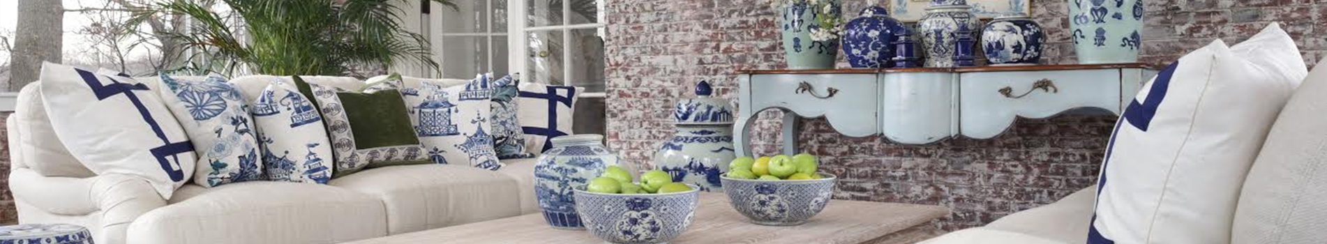
Gorgeous for this kitchen hutch
Love it as a front door too!
So beautiful in a kitchen!
And what a color in this book store!! I might ever leave:)
____________________________________________
Don’t forget all things green are 20% off until tomorrow night! We have a fabulous selection of beautiful green items, just visit shop, in search bar type in green and it will pull up all the fabulous offerings.
Thanks for stopping by. What do you think of this color? Love it because it is the perfect silvery blue. Where would you use it? I haven’t done a project in quiet a while (my own) and am itching to pull up my sleeves and dive into one. This paint color just might be the inspiration I was searching for:) Thanks for stopping in,wishign you a wonderful Saturday! We finally have sunny skies, much cooler temps but I am not complaining. Until next time….
That color is so beautiful! The kitchen is outstanding and love how they used the color in there. The home is here in GA (Buckhead) and appeared in one of the major magazines. I would copy everything that homeowner did if I were building.
I have used F&B Light Blue for several home projects for 20 years. It never disappoints. I would recommend not color matching. Nothing looks as rich as the original F&B paint.
That color gets my vote! I love it!! I feel like it would go more to the gray if it were used in a space without much natural light, though. It is beautiful and I would definitely find a place to use it.
Beautiful colour! Love Farrow and Ball paint, Can’t match their pigmentation which of course gives you that depth in colour. My bedroom, main hall, upper hall and kitchen are currently F&B.
Love love. I’ve saved that picture of the kitchen with the plates on the wall next to sink for years. Never tire of looking at it. Is there a formulation number, or just light blue (seems too simple for such a beautiful color).
The color is beautiful and it is neither too bright or dull. Just perfect. I think it would work well anywhere. I’m excited for the green sale. I hope I haven’t missed out on things I’ve had on my list.
I agree this fall weather is off to a good start. Enjoy. Hope all is well.
I also love this color and in fact painted my small sitting room off my bedroom this color last year. Every time I walk into it it makes me happy, it is soft and can read like a very very light gray or blue, it’s very soothing, I could also see it used in a beautiful nursery!
I do look forward to following along with whatever your projects in the future are Tina😊
Hi,
Loved the color so cool and refreshing and in all the room’s, really enjoyed how it just pop’s at you but in a solf way. Thank’s for sharing~~~Jean V.B.
I love this paint color! I will be painting my front door this week with it! Thank you so much for sharing this color! I have been looking for a long time for the correct color!
You can’t beat Farrow & Ball’s color selection! That blue is so timeless, so much better than the dusty blue that was overused in the 1980s. I used their Breakfast Room Green on my kitchen island, was definitely stepping out of my comfort zone, but after a decade plus, it still works. (BTW – I know the name is not great but Dead Salmon is used in museums in the UK, for some reason that color really makes art pop.)
I know that people are ‘over’ grey but for some reason, as I am looking to redo my living room, I am thinking of using grey flannel for upholstery. Maybe it’s because I love menswear suiting fabrics (and used to sell them) and live in the NE where we want to be cozy once fall arrives? I think most of us like try and keep abreast of trends but don’t want our homes to look trendy, but elegant and welcoming.
I painted the cabinets and trim in our small laundry room in Light Blue and used Shaded White on the walls. It had accents of black and white check (rug, cabinet knobs) Light Blue looks great on wood, not sure about walls. That room had no natural light and it wasn’t grey at all.
Want your daily dose of Enchanted Home? Then join our email subscriber list and don't miss a single post of The Enchanted Home delivered right to your mailbox!
Hi friends, a quick Saturday post to share a paint color I am obsessed with and determined to use somewhere. I have a few future projects up my sleeve and Farrow and Ball’s Light blue will absolutely be a part of one of them. I am in love with this color and want to show you why!! So allow me to plead my case…..
___________________________________________
Its the perfect very light, soft gray/blue
Lovely as a vanity color
And this space by Lauren Deloach is one of my all time favorites.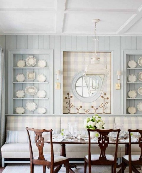
Lauren Deloach
Gorgeous for this kitchen hutch
Love it as a front door too!
So beautiful in a kitchen!
And what a color in this book store!! I might ever leave:)
____________________________________________
Don’t forget all things green are 20% off until tomorrow night! We have a fabulous selection of beautiful green items, just visit shop, in search bar type in green and it will pull up all the fabulous offerings.
Use code green
Click here to visit shop
Thanks for stopping by. What do you think of this color? Love it because it is the perfect silvery blue. Where would you use it? I haven’t done a project in quiet a while (my own) and am itching to pull up my sleeves and dive into one. This paint color just might be the inspiration I was searching for:) Thanks for stopping in,wishign you a wonderful Saturday! We finally have sunny skies, much cooler temps but I am not complaining. Until next time….
Your color choice is perfect! I would use in primary bedroom or bath- elegant and relaxing !
Where is that bookstore?? Love!!!!
Gorgeous
I think this color would be wonderful in a nursery.
Thanks for sharing
Love the color
Love it ! Can be used anywhere.
That color is so beautiful! The kitchen is outstanding and love how they used the color in there. The home is here in GA (Buckhead) and appeared in one of the major magazines. I would copy everything that homeowner did if I were building.
The color is gorgeous and can be used anywhere. However, I love it in a kitchen.
I have used F&B Light Blue for several home projects for 20 years. It never disappoints. I would recommend not color matching. Nothing looks as rich as the original F&B paint.
That color gets my vote! I love it!! I feel like it would go more to the gray if it were used in a space without much natural light, though. It is beautiful and I would definitely find a place to use it.
I’m so ready to see warmer colors. Grey had left me cold.
Beautiful colour! Love Farrow and Ball paint, Can’t match their pigmentation which of course gives you that depth in colour. My bedroom, main hall, upper hall and kitchen are currently F&B.
Love love. I’ve saved that picture of the kitchen with the plates on the wall next to sink for years. Never tire of looking at it. Is there a formulation number, or just light blue (seems too simple for such a beautiful color).
A soothing color. I love it and could see it in any room.
The color is beautiful and it is neither too bright or dull. Just perfect. I think it would work well anywhere. I’m excited for the green sale. I hope I haven’t missed out on things I’ve had on my list.
I agree this fall weather is off to a good start. Enjoy. Hope all is well.
Tina, thank you so much for this post! The Farrow and Ball blue paint is a favorite of mine, and I am also determined to use it in my next house.
I also love this color and in fact painted my small sitting room off my bedroom this color last year. Every time I walk into it it makes me happy, it is soft and can read like a very very light gray or blue, it’s very soothing, I could also see it used in a beautiful nursery!
I do look forward to following along with whatever your projects in the future are Tina😊
I’m so with you! The perfect color of blue💙
I love this color – so soft, elegant & pretty!! I think it can be used in any room.
Hi,
Loved the color so cool and refreshing and in all the room’s, really enjoyed how it just pop’s at you but in a solf way. Thank’s for sharing~~~Jean V.B.
That kitchen with the blue check fabric is by Lauren DeLoach and Design Galleria. That was an Atlanta Homes and Lifestyles show house. I was in it.
I love this paint color! I will be painting my front door this week with it! Thank you so much for sharing this color! I have been looking for a long time for the correct color!
You can’t beat Farrow & Ball’s color selection! That blue is so timeless, so much better than the dusty blue that was overused in the 1980s. I used their Breakfast Room Green on my kitchen island, was definitely stepping out of my comfort zone, but after a decade plus, it still works. (BTW – I know the name is not great but Dead Salmon is used in museums in the UK, for some reason that color really makes art pop.)
I know that people are ‘over’ grey but for some reason, as I am looking to redo my living room, I am thinking of using grey flannel for upholstery. Maybe it’s because I love menswear suiting fabrics (and used to sell them) and live in the NE where we want to be cozy once fall arrives? I think most of us like try and keep abreast of trends but don’t want our homes to look trendy, but elegant and welcoming.
I painted the cabinets and trim in our small laundry room in Light Blue and used Shaded White on the walls. It had accents of black and white check (rug, cabinet knobs) Light Blue looks great on wood, not sure about walls. That room had no natural light and it wasn’t grey at all.