In Feb. I am going to be doing my first giveaway! I will be giving a way a pair of fabulous needlepoint pillows (they are from the same company that does private label for Pierre Deux). If you like what you see on my blog, follow me or subscribe for a chance to win….
Do you dream in color? Even if you don’t you might after seeing these gorgeous rooms! Though I am the first to admit I have been timid about using bright colors in my own home (maybe because I have been waiting to reserve them to ?furnish my Caribbean retreat…lol)??A big trend in the furniture and home textile industry is lots of bright vivid colors and they are showing a lot of them right now. I guess one thing I have always thought is you can’t just do one room with a punch of color, it has to flow with the rest of the house….so does that mean you are destined to have ?a crayola box of rooms? Don’t know if I am ready for that. Like it or not there is no denying that bright colors add instant life to any room and the proof is the rooms below. It does add a lot of punch to a room..no doubt. Below is a showcase of many different rooms each infused with a lot of color. ?Let me if its a like or a love!
Kendall Wilkinson boldly mixes a bright blue turquoise and orange and somehow it works!
This is really well done, I love the splash of orange against the crisp white in this fabulous beach house guest/hangout room (Coastal Living)
Lots of vibrant blues, check out the nautical striped floor! I happen to think this is a lot of fun for a beach/vacation house.
Kendall Wilkinson did a beautiful job of mixing gorgeous shades of blues and reds here
Luxurious theater by Kerry Joyce in an all red color scheme is quite luxe
A colorful creamy orange?hall by Thomas Britt
A blue and orange study with punches of red by Thomas Britt
A grand Palm Beach living room by Juan Pablo Molyneaux
Bright green walls warm up this cozy dining area
Another view of the this Kendall Wilkinson room
Fabulous rich apple green velvet sofas add a pop of color to a traditional library
This dark navy bed is a bold statement in an otherwise neutral bedroom
A cheery yellow painted wall makes for a sunny and happy space in this center hall
Blues, yellows, pinks, and orange? All in a one room? Somehow I think its effective
This is bold with the orange damask walls, lime green chairs and blue panels on the windows
Bright sunny yellow at it again…..
Rich navy and white…very sharp?
Love the green accents here, especially the way it pulls the green from the beautiful oriental rug
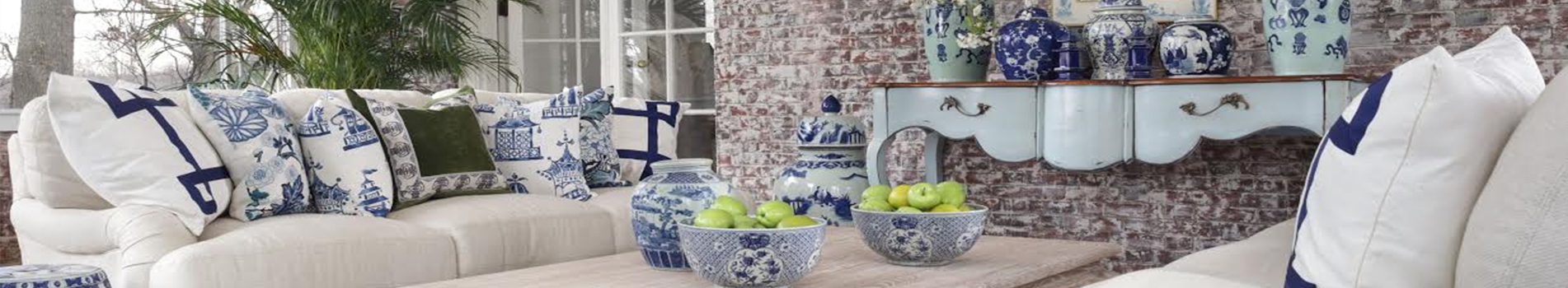
Great pops of color in this fabulous outdoor space
Beautiful Robin’s egg blue against white is so pretty and crisp
The periwinkle blue against the dark woods is a nice surprise
Lime green in a very traditional room….unexpected but lovely
Lime green covered chairs in a very traditional room is fresh looking
Beautiful blue and white is so inviting
Stunning coral/red against the green works..I like this combination, very “Palm Beach”
More blue and white…always a winner
Gorgeous outdoor terrace with periwinkle blue wicker seating
Bright red room is dramatic, love the blue and white lamps
A huge study done entirely in orange in this DC townhouse by Thomas Phesant is a unexpected surprise
Thomas Pheasant chose to do a red living room in the same DC residence
This Miami penthouse done by John Barman has punches of bright colors against a white palette to showcase the fabulous view and endless views of the ocean
Love this room….the green chairs, the bright yellow walls, it all comes together beautifully!
I like the pop of the orange chair…such a pretty shade
Reminds me of a creamsicle! I really like this room, a rosy red/pink guest room
A cozy dining area in a nontraditional red library
A green dining room, very unexpected in such a traditional room, the orange chairs take some getting used to….
Chartreuse walls? Works with the black chairs in my opinion.
I love this color orange…so pretty and warm..bet its beautiful at night! (love tufted ottomans)
Navy walls and different shades of blues somehow make for a very cohesive and cozy feel (I like the navy bookcases instead of black or your usual wood)
So let me know what you think about all this color….would you use any of these palettes in your own home or is it just fun to look at them in design magazines and books? I love to hear from you….hope you have a wonderful day!
Such a great blog, love the pictures. I personally love color. My entire house if filled with lots of vibrant color, it makes me happy and always makes me feel alive. People always comment that it gives them a very energetic charge.
Orange is great in any room, it’s my favorite color! But I stick with a neutral background and let everything else do the talking with color. Trust me on this my studio is 1500 square feet of neutral baackground for all the riot of rich colors coming from the pillows and textiles I have hanging everywhere for my business…it works!To much color everywhere on walls is not relaxing to me.
Beautiful rooms though I am personally one who likes everything to be soft and quiet. I appreciate the use of the vivid colors here. Your home is out of this world, a dream home indeed!
I’m with Acquired Objects – orange is my favorite. I love both the Kendall Wilkinson rooms even though I usually don’t have a lot of color at home. My home is much more subtle – but you’re right – color is everywhere this year. And too funny – just bought that Coast Living today!!
I love having color in my home! I do prefer a consistent color palette throughout the house. However, I create variety by emphasizing different colors in different rooms. I have reds, yellows, and greens. For example, the reds range from rosy reds to corals and rust. And so on… Even with color, I believe you always need “a place for the eye to rest” in each room. Your inspiration selections are pure pleasure to view!
What fun to think of color and what we’d like, how we’d use it…and I love all of the pictures! This rust-orange is the hue of our winter marsh grass here and I’ve never thought about using it as an interior color until this post. I may hafta’ include it some way, some how.
Living in an indoor/outdoor type of environment, I tend to use color hues that rest the eye between the two environments but do add-in yellow, accents of black and such to pop a room.
So loved this post- thanks for the information n’ inspiration!
Want your daily dose of Enchanted Home? Then join our email subscriber list and don't miss a single post of The Enchanted Home delivered right to your mailbox!
Do you dream in color? Even if you don’t you might after seeing these gorgeous rooms! Though I am the first to admit I have been timid about using bright colors in my own home (maybe because I have been waiting to reserve them to ?furnish my Caribbean retreat…lol)??A big trend in the furniture and home textile industry is lots of bright vivid colors and they are showing a lot of them right now. I guess one thing I have always thought is you can’t just do one room with a punch of color, it has to flow with the rest of the house….so does that mean you are destined to have ?a crayola box of rooms? Don’t know if I am ready for that.
Like it or not there is no denying that bright colors add instant life to any room and the proof is the rooms below. It does add a lot of punch to a room..no doubt. Below is a showcase of many different rooms each infused with a lot of color. ?Let me if its a like or a love!
Such a great blog, love the pictures. I personally love color. My entire house if filled with lots of vibrant color, it makes me happy and always makes me feel alive. People always comment that it gives them a very energetic charge.
Orange is great in any room, it’s my favorite color! But I stick with a neutral background and let everything else do the talking with color. Trust me on this my studio is 1500 square feet of neutral baackground for all the riot of rich colors coming from the pillows and textiles I have hanging everywhere for my business…it works!To much color everywhere on walls is not relaxing to me.
Beautiful rooms though I am personally one who likes everything to be soft and quiet. I appreciate the use of the vivid colors here. Your home is out of this world, a dream home indeed!
I’m with Acquired Objects – orange is my favorite. I love both the Kendall Wilkinson rooms even though I usually don’t have a lot of color at home. My home is much more subtle – but you’re right – color is everywhere this year. And too funny – just bought that Coast Living today!!
I love having color in my home! I do prefer a consistent color palette throughout the house. However, I create variety by emphasizing different colors in different rooms. I have reds, yellows, and greens. For example, the reds range from rosy reds to corals and rust. And so on… Even with color, I believe you always need “a place for the eye to rest” in each room. Your inspiration selections are pure pleasure to view!
What fun to think of color and what we’d like, how we’d use it…and I love all of the pictures! This rust-orange is the hue of our winter marsh grass here and I’ve never thought about using it as an interior color until this post. I may hafta’ include it some way, some how.
Living in an indoor/outdoor type of environment, I tend to use color hues that rest the eye between the two environments but do add-in yellow, accents of black and such to pop a room.
So loved this post- thanks for the information n’ inspiration!
so vibrant! I’m drawn to hot pink and orange right now. Looking forward to seeing pics of your new home. Just lovely. Congrats to you.
http://shadestonehome.blogspot.com/
Loving your involvement in our fabulous blog community!
The Thomas Britt design images are some of my all time favorites.
xoxo
Karena
Art by Karena